
Article's Content
Article's Content
How Checkr Turned Its Core Product Page Into an Acquisition Channel That Won Over 10K+ Users
Do a quick search for the keyword “background screening software,” and you’ll find one name consistent across all the top results: Checkr.
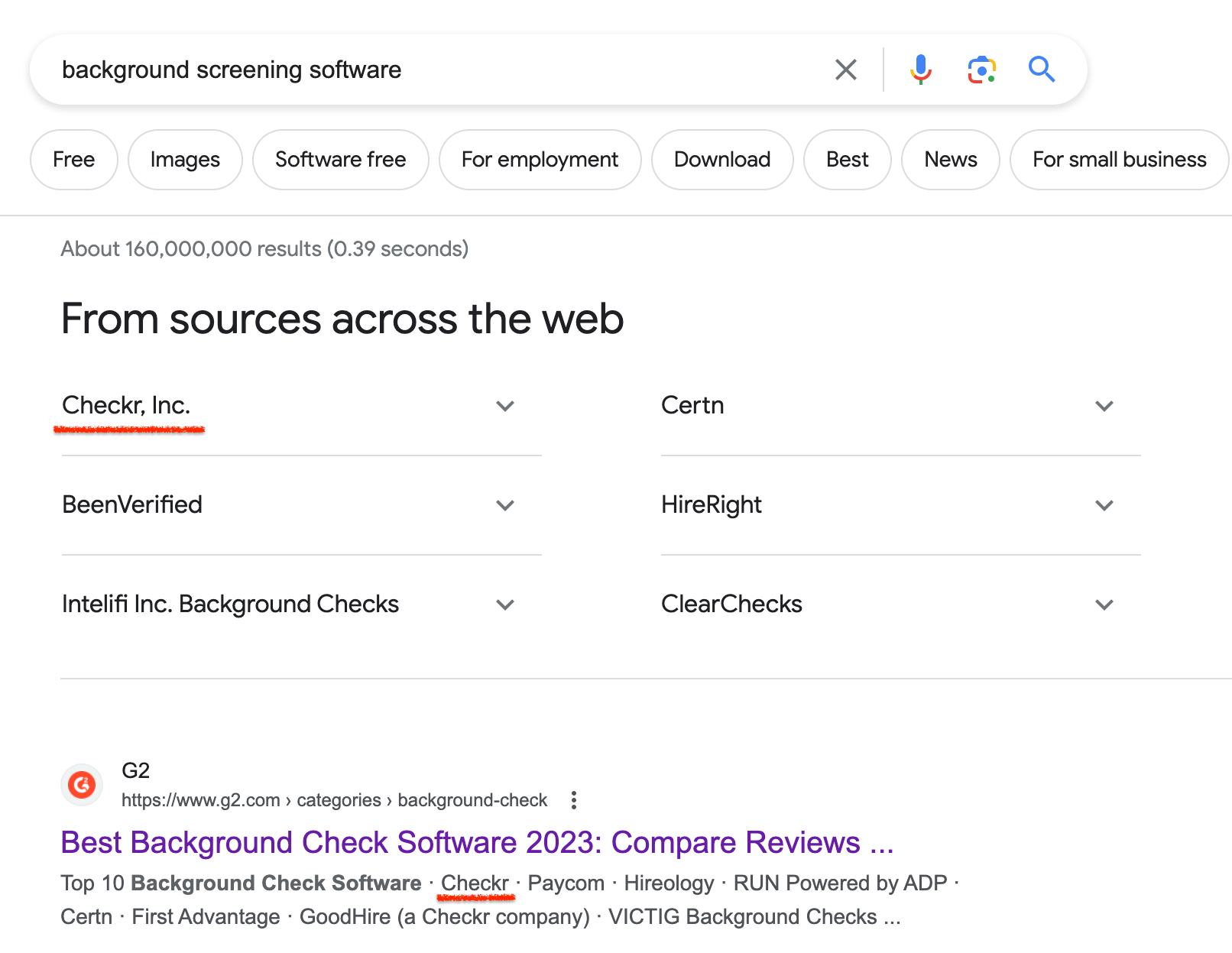
Even with more than 100 background check software listed on G2, Checkr emerges as the leader in the category. Many users rate the platform as one of the easiest-to-use platforms when it comes to running employee background checks.
The company hit a $4.6 billion valuation about two years ago, with tens of thousands of users still using the platform, including Netflix, Instacart, and Uber.
I thought these numbers were quite interesting, so I visited Checkr’s site to see what the company is doing right.
One strategy that stood out most to me was its core product page — the background check page. Like other product pages on the site, this page is structured as an acquisition channel that drives $53,000 worth of traffic each month. That’s what I break down in this case study — what makes Checkr’s core product page stand out and how to steal and implement its strategy.
Let’s jump right in.
What Makes Checkr’s Core Product Page Stand Out?
Product pages have an ultimate goal — to convince your ideal customers to take a desired action, such as signing up for a free trial or converting into a paid user. As a result, they break down what a specific product feature does and how it benefits users.
Checkr has multiple live product pages for different offerings, but none stands out more than the one on its core offering: background checks.
Do a quick search for the keyword “background checks,” and you’ll see Checkr ranking among the top 10 pages.
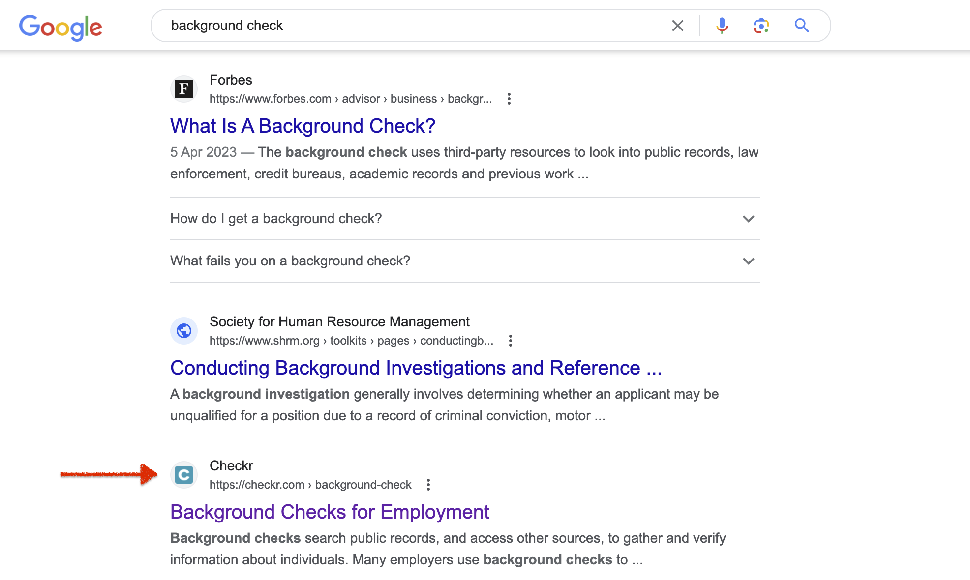
When I did a quick analysis of the top pages, I discovered seven blog posts, a comparison guide from Investopedia that ranked Checkr as the best background check software for employers, and a competitor’s homepage.
Instead of creating similar content types, Checkr used the keyword to create an in-depth product page that completely breaks down the tool’s value to potential users. As of this writing, the page drives 19,000+ organic sessions per month.
To make the most of this traffic, Checkr turned the page into an acquisition channel that helped increase customer trust and drive growth for the company. Let’s see what makes this page so effective.
1. Hero Section
The hero section is the most important part of your product page because that’s what users see when they first land on the page. It helps users understand what your product is about and how it can solve their problems or fulfill their needs. Plus, it’s your chance to leave a good, memorable impression on visitors.
For example, Checkr succinctly communicates and reinforces its value proposition, “Background checks for employment,” with the heading. The team also uses simple and easy-to-understand language to help prospects see the value they’ll get from the product — “making employment screening more efficient so you can hire faster.”
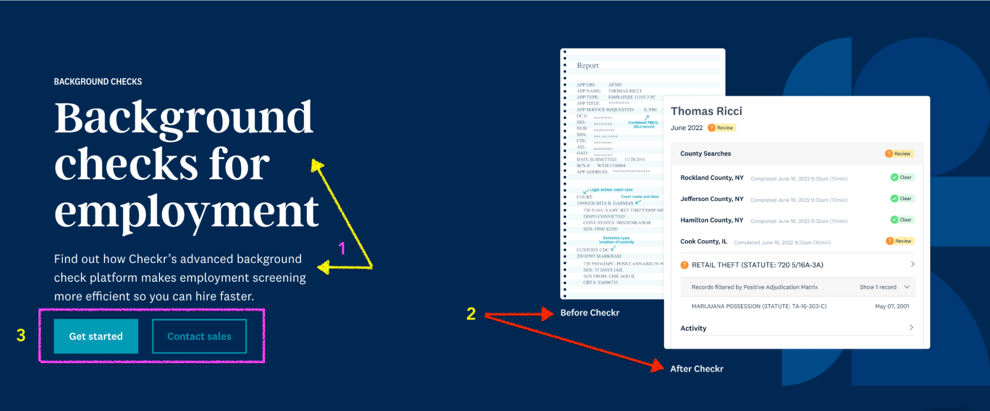
Checkr also uses a before-and-after image (the red arrows are pointing to this image) to show the prospect who they would become after using Checkr. This approach helps the ideal user visualize what success looks like, which potentially evokes more curiosity and makes them want to try the product for themselves before deciding.
The only area needing extra work is the call-to-action (CTA) buttons.
Even though Checkr lets users try the product for free, the CTA only says, “Get started.” The generic CTA lacks clarity — it doesn’t specify what users are getting started with. Is it a free trial with no credit card required? A free forever version? The lack of clarity leaves prospects in the dark about what to expect when they click the button.
A CTA such as “Try for Free” or “Start Your XX-Day Free Trial Now” clears up the confusion, letting users know what they are signing up for. Being upfront about the offer also establishes trust with potential users, eliminating any confusion or suspicion about hidden costs.
Bottom line?
The hero section is the first thing users see, so you should use clear language to convey the product’s value and how it solves users’ needs.
Visual aids, like before-and-after images, also help users visualize the product’s benefits. Ahrefs use social proof instead to show the number of signups they’ve recorded in a week. Some companies use video walkthroughs. Think about your ideal audience’s preferences and choose a format that’d resonate most with them.
Finally, ensure your call-to-action buttons are specific and transparent about the offer to build trust and eliminate confusion.
2. Defined Audience
When potential customers land on your product page, they want to know if your solution aligns with their needs. Including explicit information about your ideal users in your copy helps them quickly determine if the product is relevant to them, which increases the likelihood of them engaging and ultimately trying your product.
Checkr makes it easy for visitors to see if they fit the company’s ideal customer profile (ICP) by calling out the specific business size it serves — small businesses and enterprise organizations.
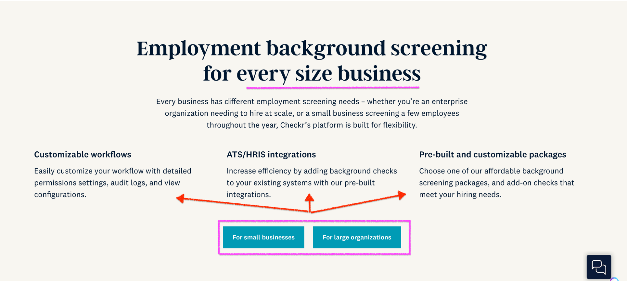
To avoid sounding too generic (literally every company falls in one of these categories), Checkr calls out the specific pain point its ICP has so it’s clear and easy for the reader to self-identify with the problem and become more interested in learning more. I also love how the company follows up with three of the background screening tool’s features to show their main benefits to the user.
Checkr also has a menu section and individual product pages like Salesforce that breaks down its custom solution for different industries and company sizes.
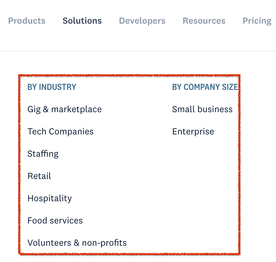
Visitors can quickly identify with their niche and see how Checkr can help them.
For the CTA, I still think it’s not specific or clear enough for the reader to know what action to take. Sure, some people might be able to tell that the “for small businesses” button leads to a page where you get to see the customized solutions for SMBs.

But what if they added a single line of text like “See how we can help you” or “See how we help you and tens of thousands of companies run background checks?” Both options are more specific and immediately communicate the primary use case of your SaaS product. The latter highlights Checkr’s success by mentioning the tens of thousands of companies using it, which helps to build trust and credibility.
Bottom line?
Make your ICP feel like you understand their pain and can help them achieve their goal by directly calling them out in your copy. But don’t stop there. Give them an insight into the benefits of your solution and follow up with a compelling CTA that encourages them to take the desired action.
3. Social Proof
The main goal of a product page is to educate visitors about a specific tool’s or feature’s value, build trust, and turn visitors into trial, freemium, or paying users.
Trust is the bridge here that connects and moves an ideal user from solution awareness to becoming a customer. And what better way to build trust than to use social proof — what past and current users think about the product?
Like ShipBob, Checkr uses user ratings from third-party review sites and testimonials to show that real organizations have relied on (or are using) its background screening tool to hire the right employees while staying compliant.
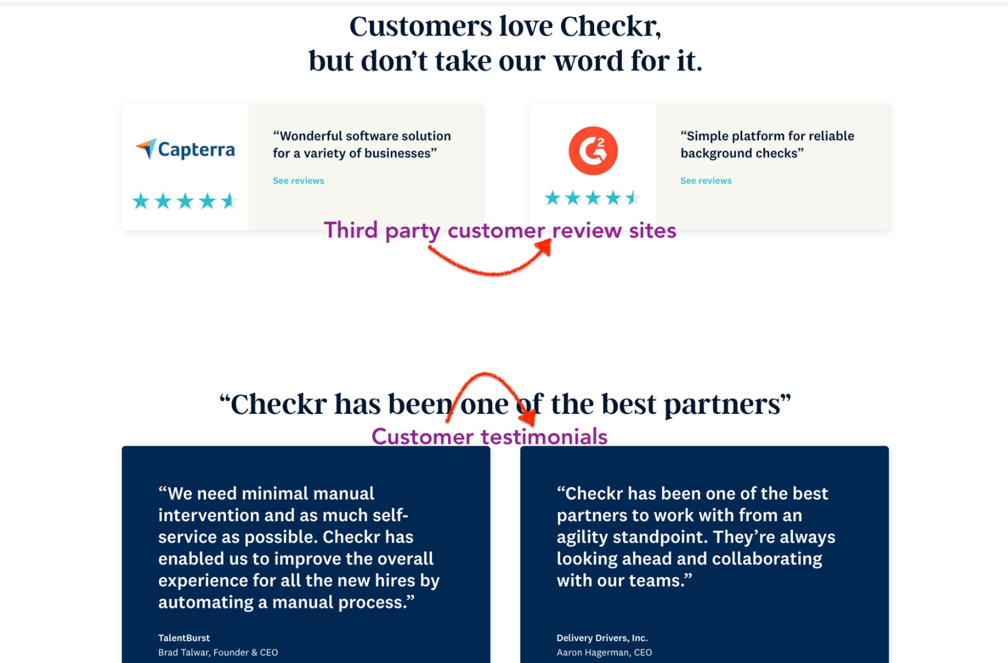
And as we might already know: People trust people more than a company tooting its own horn without concrete evidence of success.
Reviews from a recognized platform like Capterra and G2 are usually from actual product users, so it’s easier to trust its authenticity than promotional content from the company. Prospects can see how satisfied users truly are with Checkr. A high overall rating shows the product is reliable, well-loved by customers, and worth considering.
Additionally, testimonials humanize Checkr and create a connection between potential customers and existing users. They showcase the real people behind the positive experiences, making the company more relatable. Plus, testimonials provide authentic and unbiased feedback like reviews. These positive experiences from existing users help alleviate doubts and increase confidence in the buying decision.
Bottom line?
Weave social proof into your product pages to build trust. Find out what users are saying about your product from review platforms, social media, and even from surveying your own users to get their success stories (which you can repurpose into various social proof types).
To help you do social proof the right way, check out these two articles:
- ShipBob’s Billion-Dollar Social Proof Formula
- How to Use Customer Success Stories To Gain New Users’ Trust
4. Service Offerings
If you’re familiar with the topic clusters strategy, you’ll know one of its key elements is a pillar page. It is a comprehensive, long-form piece of content that serves as the main hub of information for a specific topic on your site. The page becomes a valuable resource for visitors who need comprehensive information on that subject.
Checkr’s core product page doubles as a pillar page.
The company highlights the benefits of using the product as well as its core background check features.
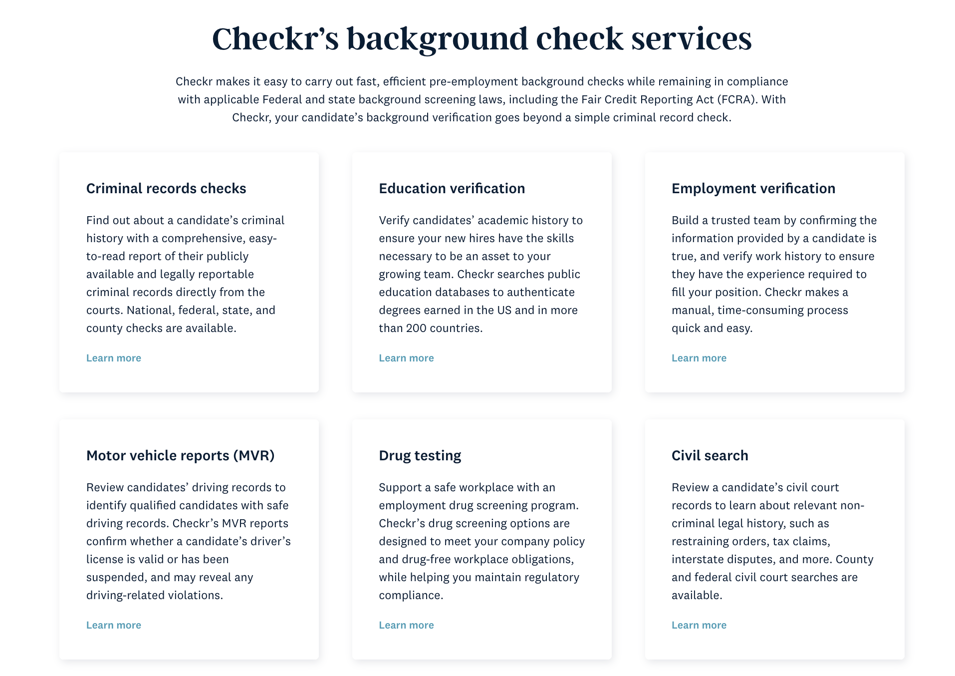
Anyone can click on each of the different background check services Checkr offers according to their needs. And that’s not all.
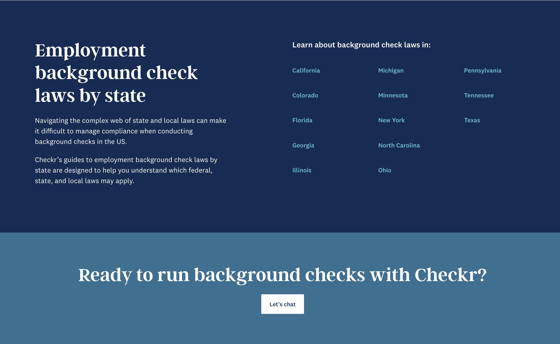
The page, now acting as a pillar page, includes a section that covers the additional context an ideal customer would want to see before making a decision — location-specific guides on background check laws. This directly supports the ICP’s desire to stay compliant while achieving their goals using the product. Plus, it attracts users from different parts of the geographical location Checkr primarily targets (the US).
Checkr also includes an FAQ section that answers specific questions related to employee background checks.
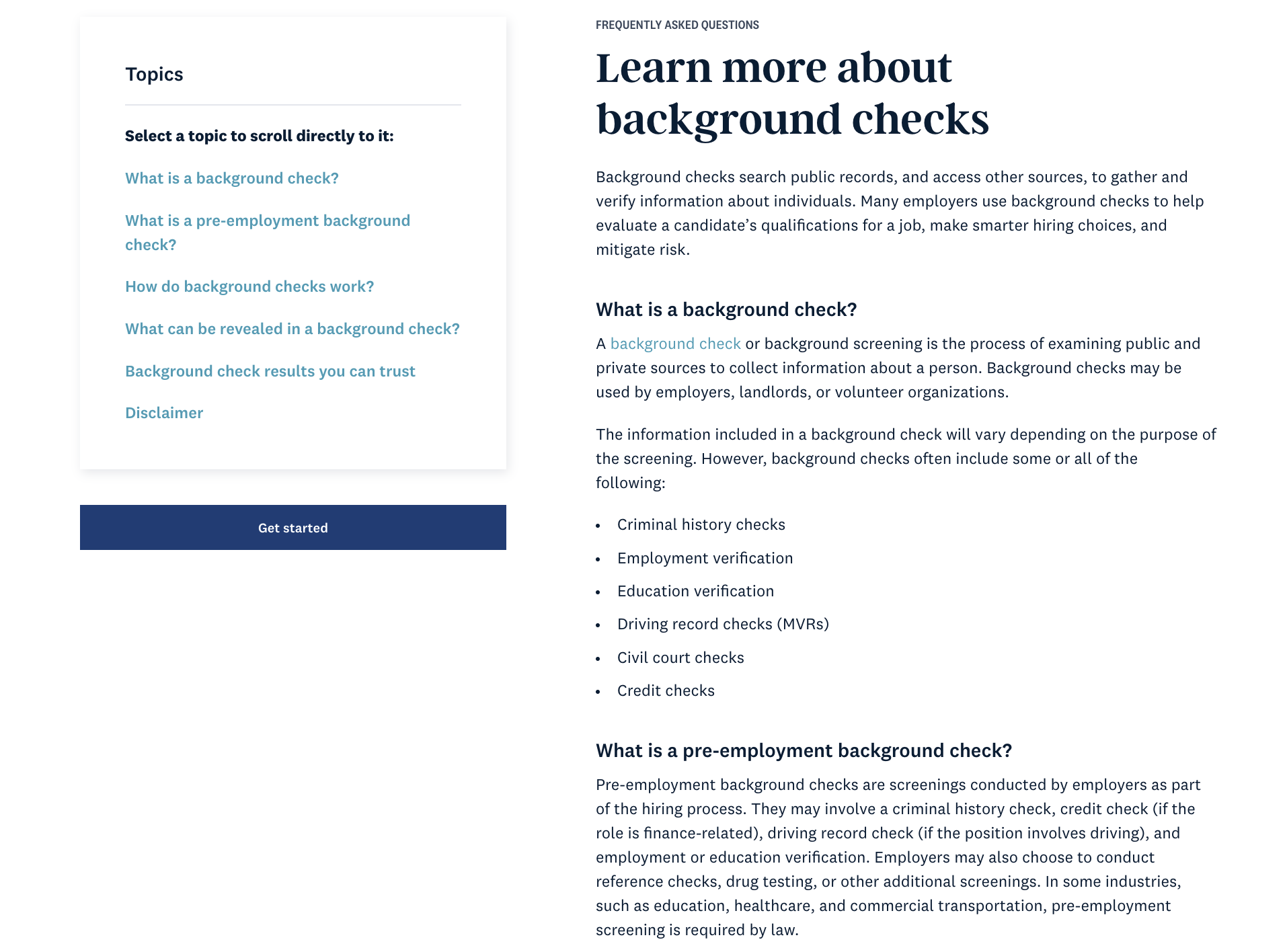
The section addresses relevant long-tail keywords such as:
- What is a background check? – 90 monthly searches
- What is a pre-employment background check? – 150 monthly searches
- How do background checks work? – 800 monthly searches
- What can be revealed in a background check? – 70 monthly searches
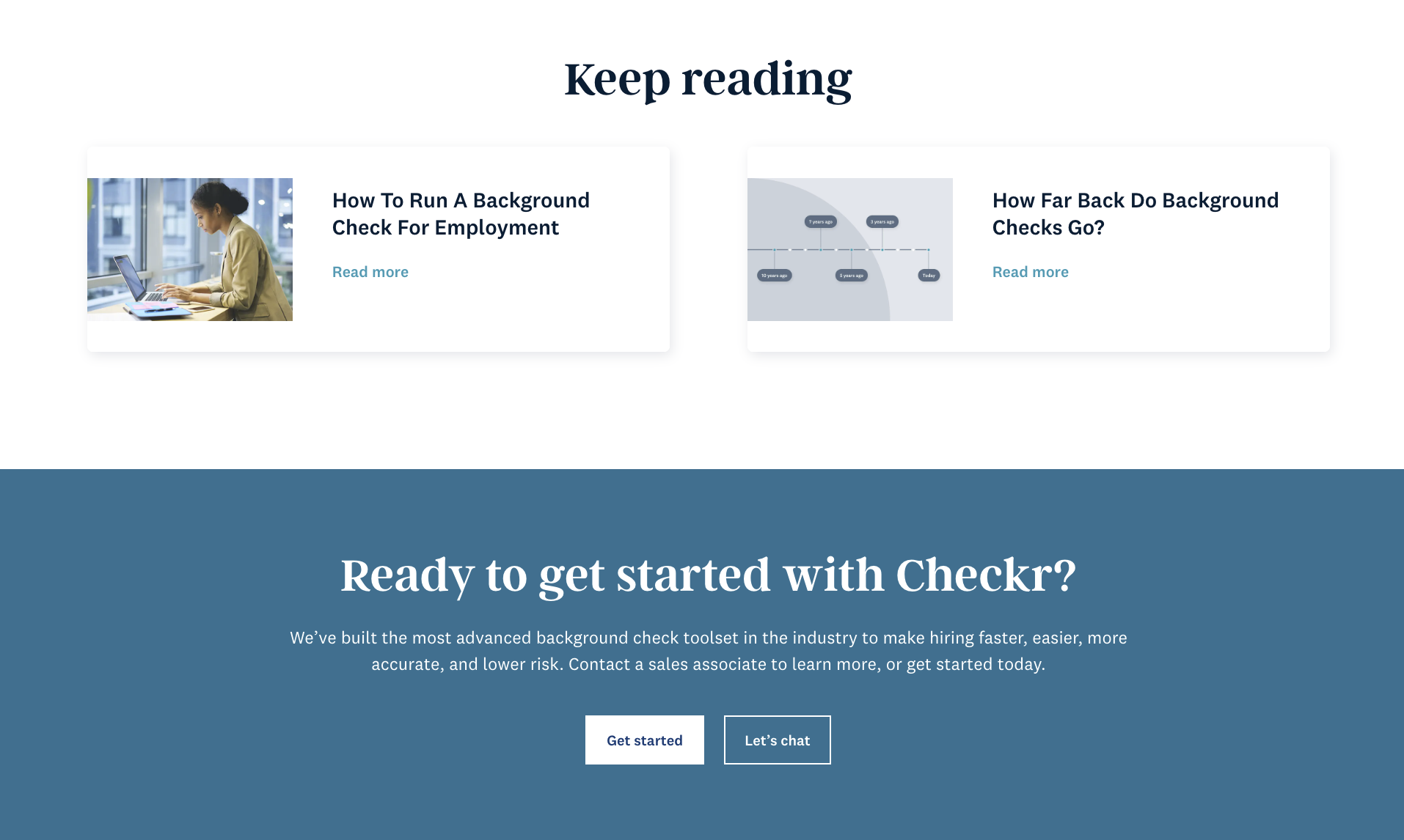
Even with less estimated search volume, these keywords are high-intent, which means anyone in search of a solution who reads this has a higher potential to convert than others. And if the reader needs more information before making a decision, Checkr wraps up nicely with a “keep reading” section which offers the prospect additional resources.
The product feature–pillar page hybrid helps establish Checkr as an authority in the employee screening domain, showcasing expertise beyond its product offering. The comprehensive information also attracts those interested in HR, hiring, and screening practices, not just those specifically looking for background screening software.
Bottom line?
Make your product page more than a self-promoting list of features. Instead, offer more value to the reader by answering questions they have and providing additional resources to ensure they learn everything they need to know about your core (or other) offering to make a solid decision.
Turn Your Product Pages Into an Acquisition Channel
When potential customers land on well-designed and persuasive product pages, they are more likely to convert into paying customers or sign up for trials and demos. Plus, optimizing these pages for search engines can increase your organic visibility and attract users who are actively searching for solutions like yours.
To turn your SaaS product pages into an effective acquisition channel:
- Understand your ideal users, their pain points, needs, and preferences.
- Identify relevant keywords and incorporate them strategically into your product pages’ titles, headings, and content.
- Create persuasive and informative content that highlights the unique selling points of your SaaS product — the benefits it offers and real-life use cases.
- Include high-quality visuals to make your product pages engaging.
- Use customer testimonials, case studies, and user reviews on your product pages to build credibility and encourage potential customers to take action.
- Place a clear and compelling CTA button on your product pages, encouraging visitors to sign up for a trial, schedule a demo, or take the desired action.
- If possible, offer transparent pricing information or a pricing calculator on the product page to help potential customers evaluate the cost of your product.
- Provide the option for potential customers to try your SaaS product with a free trial or demo.
Also, don’t forget to regularly track user behavior on your product pages to identify areas for improvement and optimize your acquisition strategies. And feel free to experiment with different layouts, content, and CTAs so you can fine-tune your pages and optimize for higher conversion rates.
