Article's Content
The SaaS industry is fiercely competitive today.
Ten years ago, customers leaned on a small pool of about 350 martech tools to solve their challenges. Today, 350 martech tools have ballooned to almost 10,000 in 2022. This steep rise means customers can now access better tools for their tech stack.
So how do you position your SaaS tool as a better alternative in a crowded market?
You use comparison pages.
A comparison page is a silver bullet for acquiring customers who are shopping for a new SaaS tool or customers who are dissatisfied with their current tool. These pages include Your Product vs Competitor Product pages, competitor comparison pages, and so on.
Pipedrive is one SaaS brand that truly shines in using comparison pages. Just look at their comparison pages scorecard.
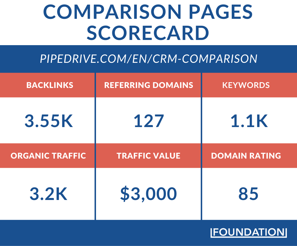
Each of Pipedrive’s comparison pages can power up its revenue engine more than its top-of-funnel content. Why? Prospects who are comparing Pipedrive with an alternative have a high search intent or a burning desire to purchase either Pipedrive or its competitor’s product.
In this post, we’re going to show how Pipedrive creates and drives results with their comparison pages. You’ll uncover:
- The breakdown of Pipedrive’s SaaS comparison pages
- How Pipedrive saves over $30,000 in ad spend
- How Pipedrive generates over $1M returns from its comparison pages
- A blueprint for creating your SaaS comparison page
- The internal linking brilliance in Pipedrive’s comparison pages
Let’s get into the breakdown.
Attracting High-Intent Traffic with 11 Comparison Pages
Creating lots of comparison pages is the first element that sets Pipedrive up for success. Currently, Pipedrive has 11 comparison pages that attract 36,624 organic visits annually.
These organic visitors benefit Pipedrive in two ways. The first is by helping Pipedrive generate revenue once they convert and become a customer.
Generally, we can calculate the revenue from these pages by multiplying the number of organic visitors by a modest conversion rate of 10% and an average customer spend of $280 in 12 months.
This results in over $1M in annual revenue. But this figure doesn’t tell the whole story. To fully appreciate the impact of each page, we can drill down on the search volume of top-ranking keywords on each page. We also need to consider that clickthrough rates differ for each position on the search engine result pages.
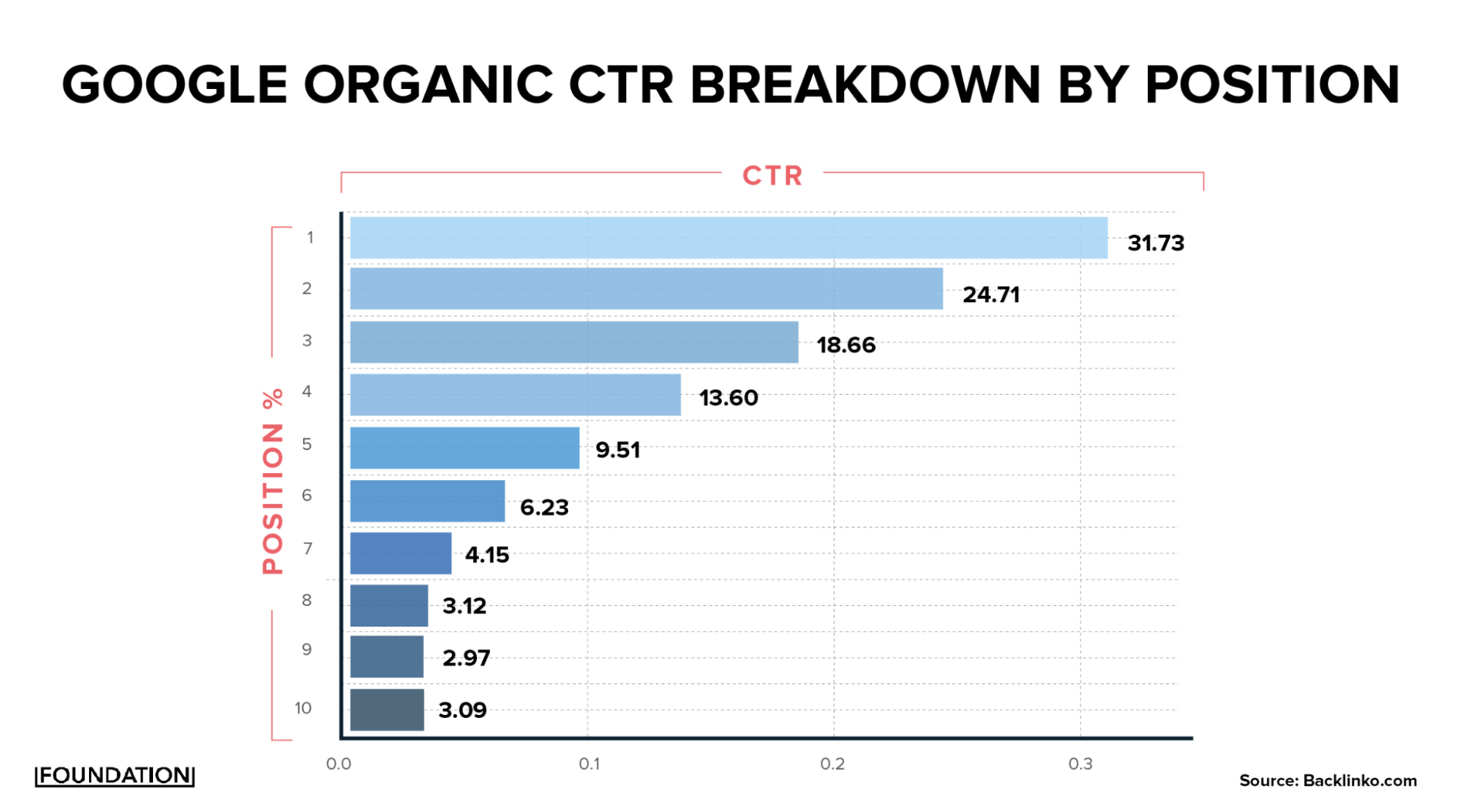
Putting these data together helps us calculate the estimated return of each comparison page. Take Pipedrive’s Salesforce comparison page, for instance. This page ranks for 149 keywords.
Some of the top-ranking keywords are:
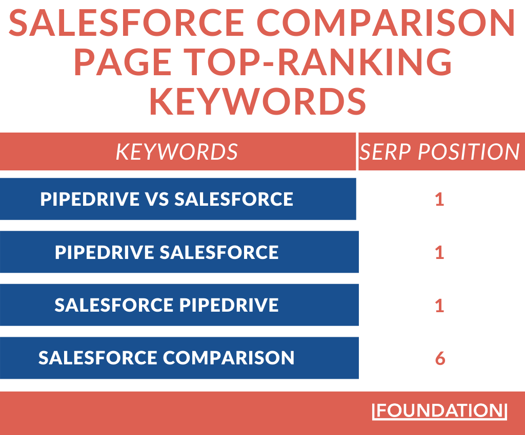
We can see how the keywords impact revenue by multiplying these variables:
- Annual search volume
- Conversion rate
- Estimated average annual customer spend
- Clickthrough rate

Doing this gives us an estimated total return of $25,148 from these keywords. Considering that Pipedrive has 10 other comparison pages, it’s easy to see how these pages oil Pipedrive’s revenue engine.
While Pipedrive’s return from its comparison pages is important, we must also not lose sight of a vital element that helps them — excellent keyword research.
When doing keyword research, you want to ensure you cover all bases for a comparison page. Here are some insights on keywords to target for each comparison page you create:
- {Your product} vs {competitor}
- {Your product} vs {competitor} comparison
- How {Your product} compares with {competitor}
- {Competitor} alternative
- From {competitor} to {your product}
Onward …
The second benefit that Pipedrive derives from its 36,624 annual organic annual visitors is in ad spend savings.
Attracting this high number of free high-intent traffic helps Pipedrive to save money because the CPC of the page’s target terms are high. CPC is the amount a brand pays advertising networks when someone clicks on a keyword they bought.
To see how this looks, let’s consider the Salesforce comparison page once more. Among the 149 keywords ranking on this page, one is Salesforce CRM alternatives and its CPC is as high as $75.94. This equates to $75,940 if 1,000 people click on a Pipedrive ad. Similarly, Pipedrive would be considered one of the top Hubspot Alternatives on the market.
As if this money isn’t big enough, it could all get flushed down the drain through click fraud. According to Investopedia, click fraud occurs when a human or a software program (script) clicks on ads posing as legitimate users but without any intention of following through with a purchase.
By trying to organically rank for these terms without ads, Pipedrive not only saves what it would have spent but also shields itself from click fraud that wastes its resources.
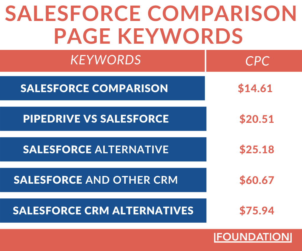
The data gets more interesting when we calculate the monthly and annual ad spends saved by just the keywords that currently drive traffic to the comparison pages.
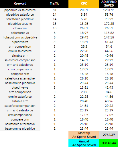
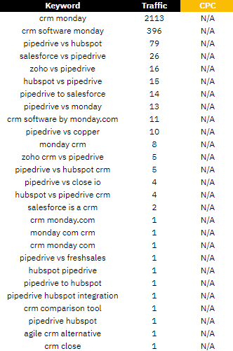
And when you factor in keywords that pull in lots of traffic (ex. CRM Monday) but don’t have CPC data from Ahrefs, you will see that Pipedrive is saving a lot more than we currently know.
Aside from the interesting data on how Pipedrive saves and generates money with its comparison page, these pages have great structure and copy.
Let’s dive into them.
Comparison Page Structure
Pipedrive’s comparison pages have a similar structure. This shows that there is a customizable comparison page template at play.
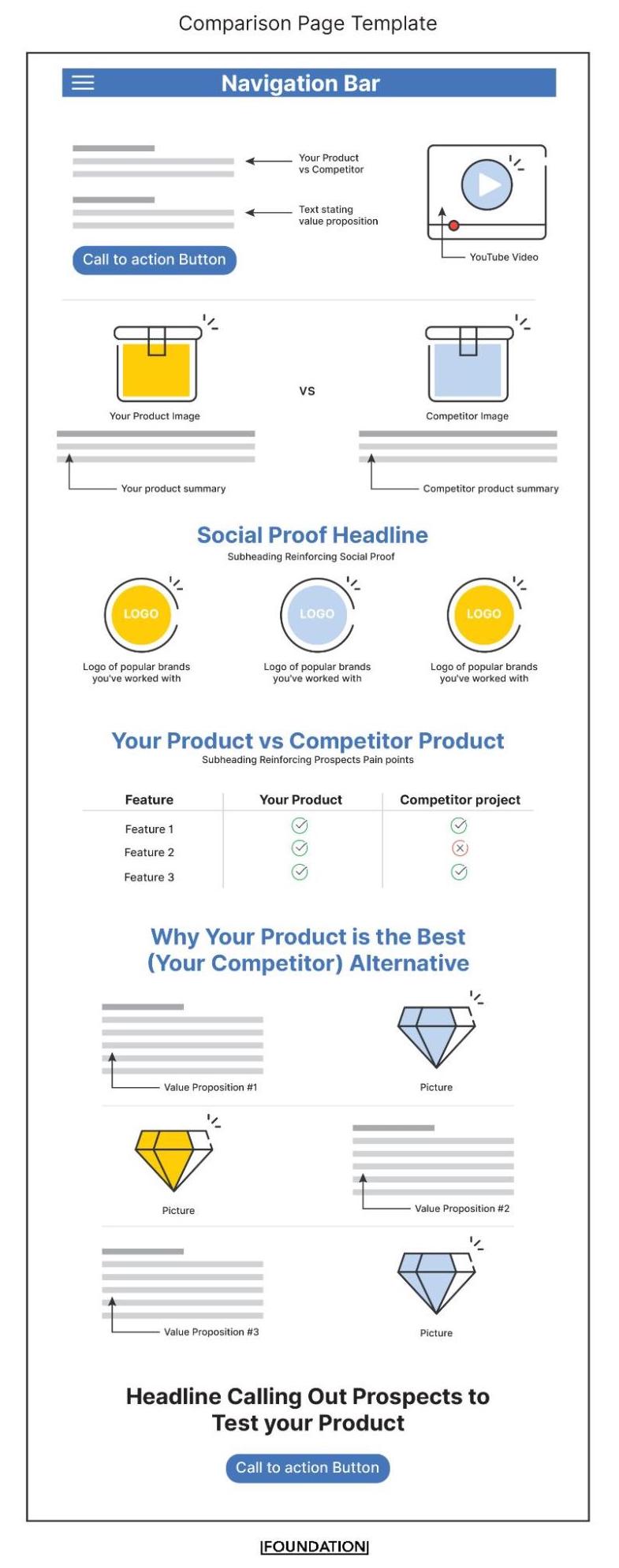
Using a templated approach like Pipedrive often cuts down on your marketing budget because you eliminate or significantly reduce your dependency on a developer when creating more comparison pages. Brands like Shopify use the templated approach and the result is $6M worth of traffic to some of their most important pages.
Comparison page structure aside, you need to think about what goes into each page you create. You should identify your competitors, find their strengths and weaknesses, consider the trust elements to use, organize them, and include SEO in the mix.
Pipedrive Comparison Pages SEO Structure
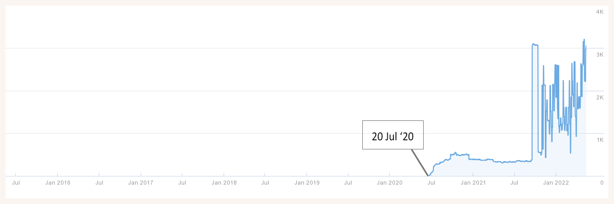
One of the best marketing tactics you can apply when building your website is to plan your website hierarchy from the get-go. A part of building out Pipedrive’s hierarchy is creating their subdirectory CRM comparison page on the 20th of July 2020 as seen on Ahrefs. We will dive into why this is a good move. But first …
What is Website Hierarchy?
Website hierarchy is the ordered arrangement of pages on your website. These hierarchies can exist on both root domains and subdomains.
The root domain is the primary URL of any website. For instance, Pipedrive’s root domain is pipedrive.com.
A subdomain is the addition of new text to a root domain. An example is blog.hubspot.com. In this case, hubspot.com is the root domain.
For Pipedrive, their comparison page hierarchy consists of subdirectories on the root domain. Here’s a pictorial explanation:
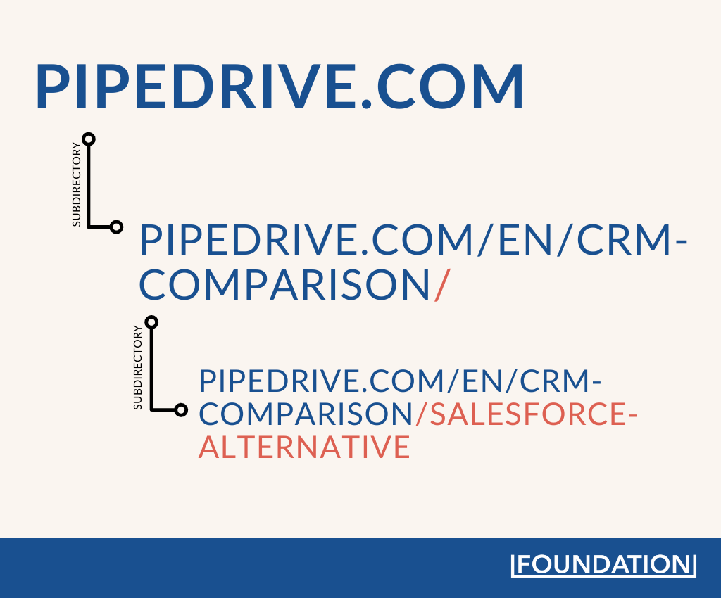
Designing a website architecture like this helps keep Pipedrive’s comparison pages organized, makes them easy to navigate by humans and search engines, and it creates internal linking opportunities that Pipedrive brilliantly executes.
Within the disclaimer section of some of Pipedrive’s comparison pages, we see a link to the CRM comparison subdirectory.

This approach makes sense because Pipedrive comparison pages will now share ranking factors like backlinks and page/domain authority with the primary subdirectory (the CRM comparison page). Plus, because the URL is short, all backlinks and page authority remain near Pipedrive’s root domain and this is an SEO booster.
The result of Pipedrive’s internal linking brilliance is that Pipedrive /crm-comparison page retains the top spot on page 1 of the SERP.
You can apply Pipedrive’s approach by going further to use the topic cluster model.
The Topic Cluster Model
The topic cluster model thrives on links, a pillar page, and cluster pages.
Here, Pipedrive’s parent subdirectory (CRM comparison page) will serve as the pillar page. And the competitor alternative pages are the cluster pages.
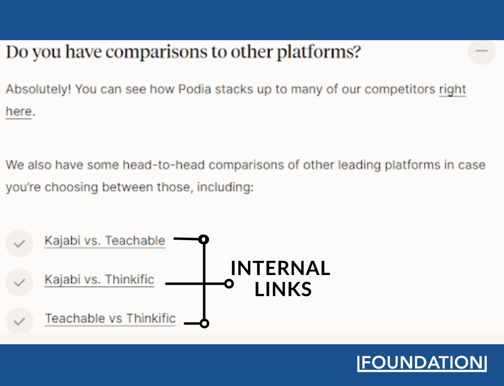
Once you have the pages set up, the next step is to find ways to pass internal links across the cluster and pillar pages. A smart way to do it is to include these internal links in your FAQs section as Podia does.
Moving Up the SERP with Video Excellence
Numerous studies show that time-on-page is a search engine ranking factor. In fact, take it directly from search engines like Bing, which publicly acknowledged it.

While other search engines like Google haven’t publicly recognized time on page as a ranking factor, lots of evidence suggests Google uses it for ranking content.
And you know one element that increases time on page?
Videos!
Pipedrive has videos on all of its comparison pages.
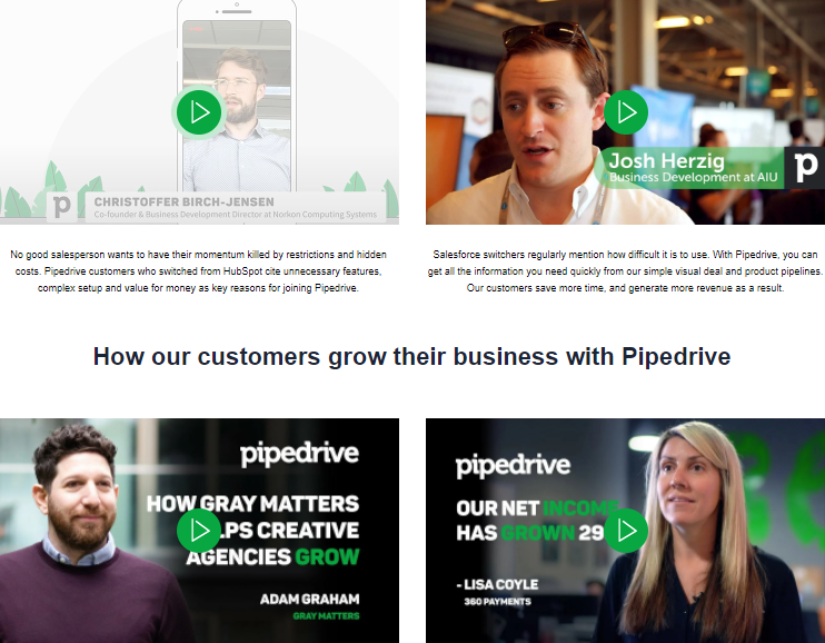
These videos improve stickiness and make visitors stay longer on each page. The result? Search engines know that Pipedrive comparison pages are excellent assets, so they increase their rankings.
We see these better rankings play out upon searching for a term like “Pipedrive vs {competitor}.”

This is impressive.
However, there’s a dip in ranking for the /monday-alternative page. This page has no videos and the video that ranks for this keyword is on Pipedrive’s primary CRM comparison page (/crm-comparison).
That aside, the main question is why did Pipedrive opt for videos? Why didn’t Pipedrive just use text copy throughout their comparison pages?
The answer? Trust.
Videos are one of the best trust elements that can turn prospects into customers.
Take this video comparing Pipedrive and Salesforce, for instance.
It is engaging, entertaining, and it’s short and easy to digest. A video like this is an excellent conversion asset because Pipedrive’s prospects can relate to the switcher’s story whose pain points they likely feel. And it’s these pain points that make customers switch products.
Why Customers Switch Products
Customers switch products when software is difficult to use, expensive, has limited functionality, the support team isn’t responsive, and many more.
Before you create your comparison page, find out the exact pain points that resonate with your competitors’ users. You can identify them on Reddit, Quora, social media platforms, and more. You can also go further by conducting video interviews with customers who switched to your product.
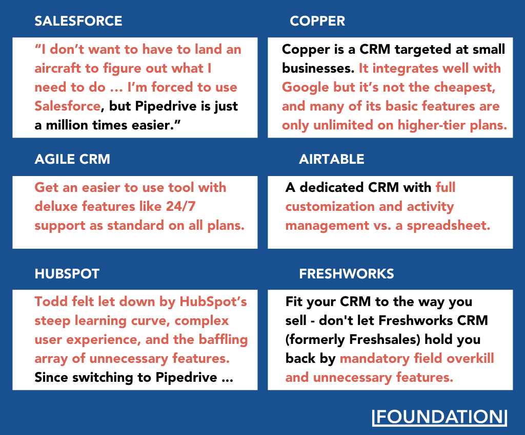
This enables you to use your switcher’s words, hit on the switcher’s pain point throughout each comparison page, and position your product as the solution. These are the backbone of Pipedrive’s copy on its comparison pages.
Driving Home the Pain Points
An interesting thing about Pipedrive comparison pages is how they call out the pain points of an intending product switcher just before a head-to-head comparison.
Repeating the customer’s pain point is an excellent marketing play that reinforces the desire to switch. According to Gretchen Schmelzer, repetition is one of three ways information moves from short-term to long-term memory.
But that’s not all.
To strengthen Pipedrive’s position as a better alternative, they emphasize their competitors’ weaknesses by highlighting their deficiencies.
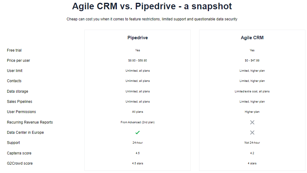
And to seal the deal, Pipedrive uses more trust elements like case studies, the total number of users, media mentions, and customer testimonials to show why their prospects should become customers. Some of these trust elements are even positioned as a call to action. Let’s find out why.
Multiple CTAs
Before writing this post, I checked the comparison pages of several brands and I saw most brands using a popular CTA: “start a free trial”.
Sure, you want users to try your product today, but what if they are not ready?
This is where using multiple CTA makes sense. Pipedrive has a CTA that directs the reader to their bottom-of-funnel case study assets. These case studies have an opt-in form at the end where Pipedrive can capture emails from high-intent prospects and nurture them.

How about the CTA “Download the report”?
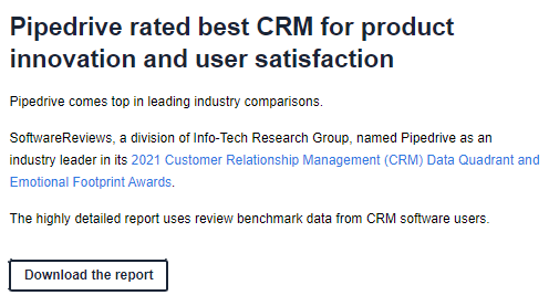
This CTA does the same job of getting the emails of high-intent prospects who could opt for Pipedrive’s product with a little nudge. You can use other CTAs in your comparison pages like a report download, sign up, try (Product) for free, schedule a demo, and even use a chatbot to acquire emails of ready-to-buy prospects.
Creating Comparison Pages that Hit the Bull’s Eye
Like a game of darts, you want to create a comparison that goes straight for the bull’s eye. This kind of page covers all the bases and is positioned to win prospects at a decent conversion rate.
Similar to Pipedrive, you can win with comparison pages when you include the videos of product switchers, strategically place trust elements all over the page, drive the pain points home via repetition, and bake in SEO.
Remember that adopting the topic cluster approach is also beneficial and you should really consider it when creating your comparison page. Implementing all of these with a templated comparison page structure is exactly how you win prospects while spending less money and resources in a competitive SaaS market.
Quick, do it now before the next drop!


