Article's Content
B2B SaaS is a very crowded, competitive SaaS industry — we all know that. It’s the reason why marketers and other industry experts are constantly looking for the next best thing, whether it’s demand generation or product-led content.
But there’s a particular type of asset, a mainstay in the industry, that’s been used effectively by the likes of HubSpot, Zoho, and Ahrefs:
Comparison pages.
It’s the not-so-secret weapon for boosting organic traffic. Comparison pages help brands stand out from their rivals by offering clear, direct comparisons of product features. More importantly, they help brands capture valuable Search Engine Results Pages (SERP) real estate.
In this piece, we’ll dive into the organic-traffic-boosting powers of comparison pages and take a look at how some of the top SaaS brands in highly competitive niches use them to boost their Search Engine Optimization (SEO) practices.
Let’s get started.
Comparison Guides and Organic Traffic — A Match Made in Heaven
In an industry with so many direct competitors, differentiation is key. Brands strive to distinguish their offerings from a sea of competitors. This is especially true in well-established, well-defined niches like CRM, SEO, and sales enablement tools.
One effective strategy to increase organic traffic is the use of comparison pages.
What Are Comparison Pages?
Comparison pages are landing or blog pages specifically designed to compare one software vendor’s products against their competitor(s). These pages can be created internally by the companies themselves or by third-party software review sites like G2 and Capterra.
These types of pages offer a direct comparison of features, benefits, and unique selling propositions (USPs) of services/products and serve to help potential customers who are indecisive about their purchase.
Let’s take a look at some of the common features of these pages and examples from real SaaS brands:
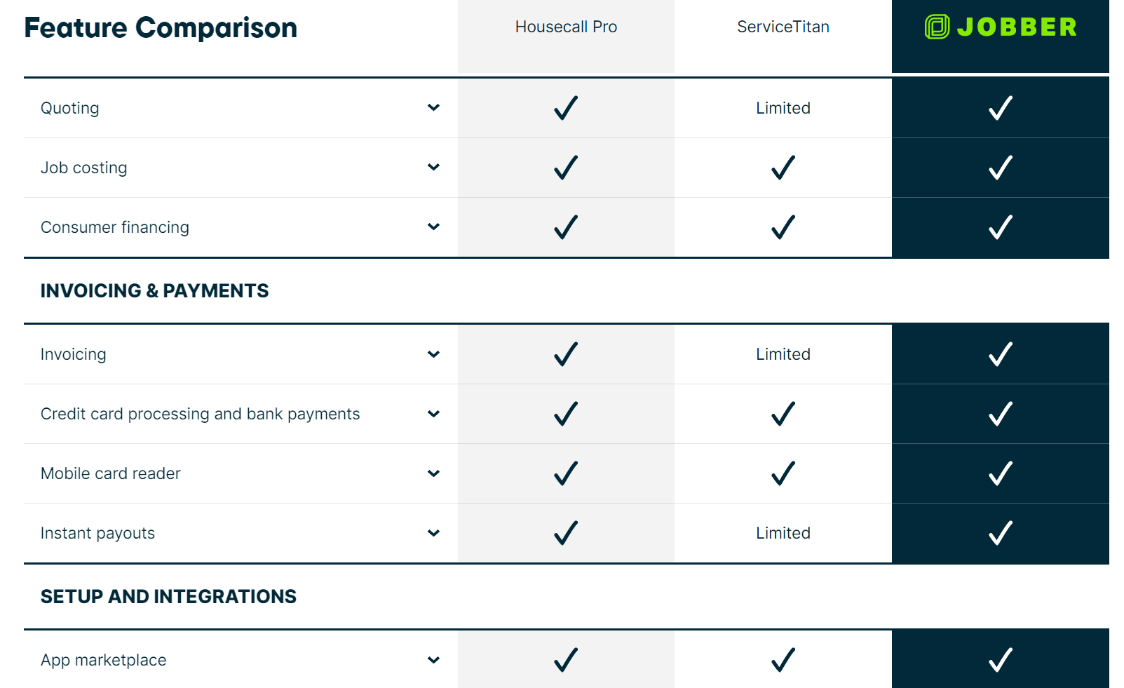
- Use of Comparison Tables: These utilize simple and interactive designs to visually break down the features and benefits, making it easier for visitors to read at a glance and wrap their minds around the different aspects.
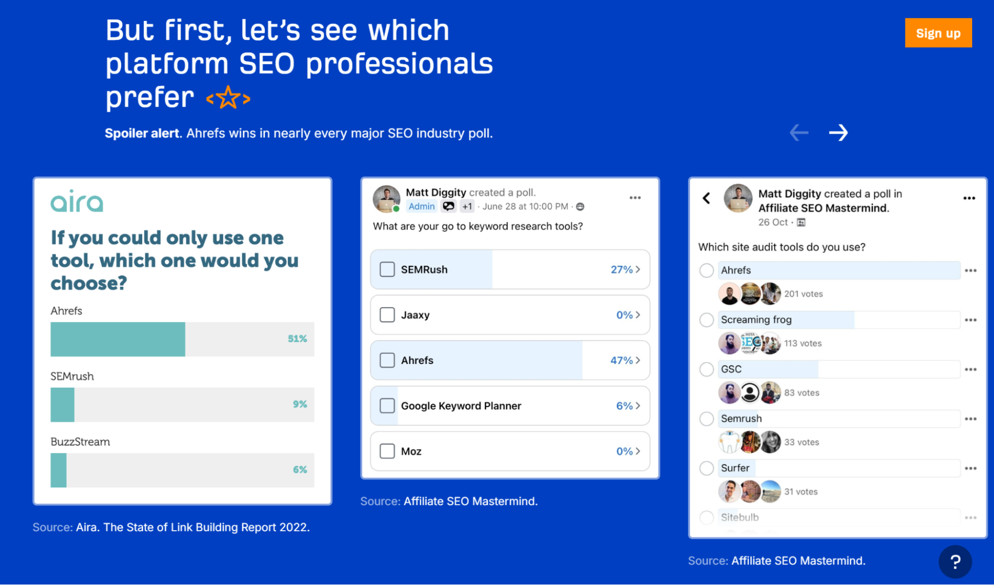
- Inclusion of Social Proof: Customer testimonials, awards, and case studies lend credibility and help build trust with potential customers.
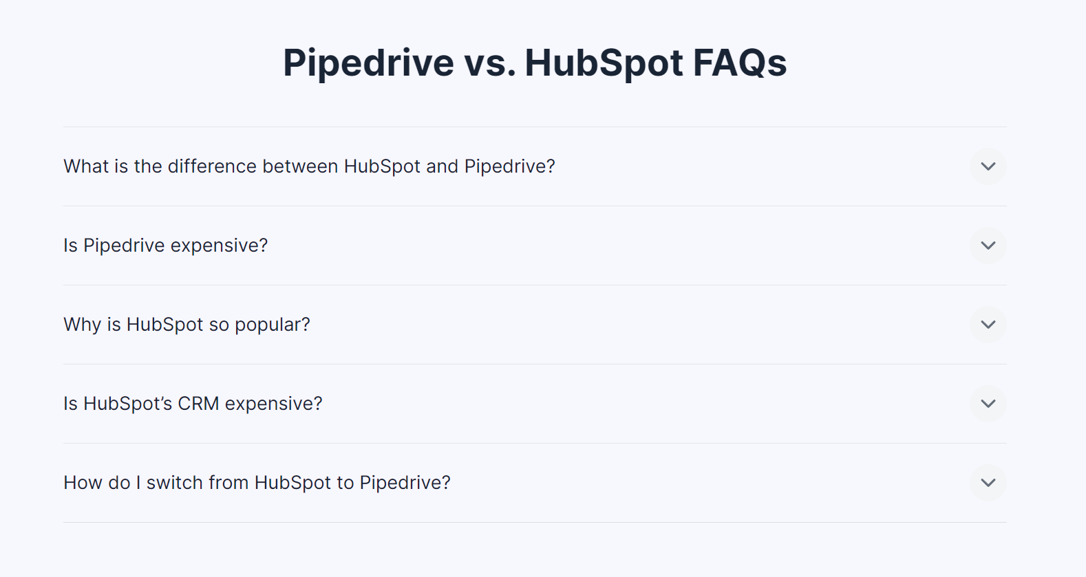
- Addressing Relevant Questions: These pages often tackle key customer concerns, highlighting how a product addresses specific pain points.
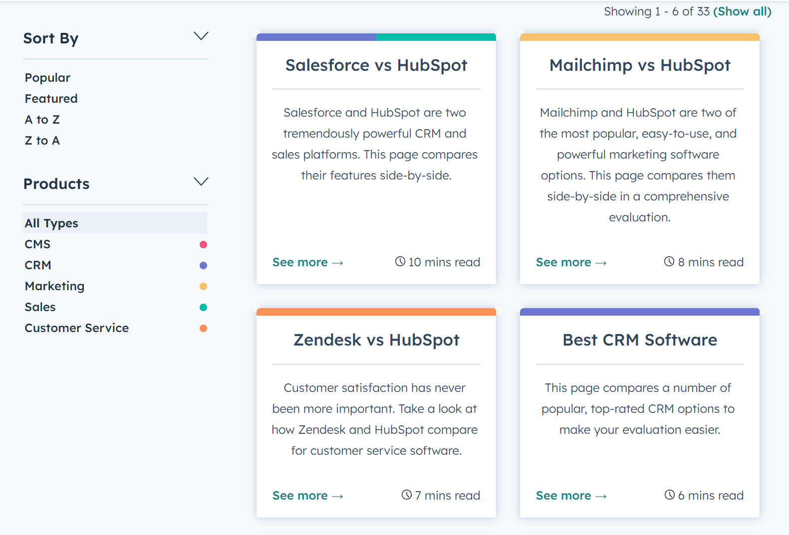
- Multiple Comparison Pages: Having individual pages for each competitor enhances SEO and also allows for more thorough comparisons (such as the use of specific questions in a FAQ).
- Advertorial Style: A blend of advertising’s persuasiveness with editorial flair creates compelling product comparisons.

Types of Competitor Comparison Landing Pages
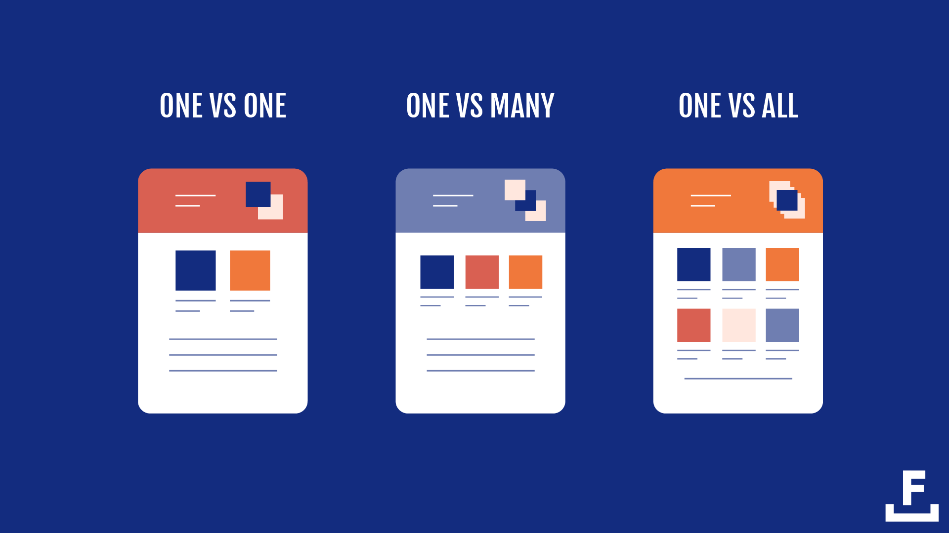
Aside from looking at the specific components of comparison pages, there are variations of flavours of comparison pages that SaaS companies typically use: One vs. One, One vs. Many, and One vs. All.
- One vs. One: A detailed comparison between two products, highlighting the nuanced differences.
- One vs. Many: Comparison tables to compare several products against each other.
- One vs. All: A focus on a single product against the broader market.
Why Comparison Pages Are Important in B2B SaaS
Here are some of the main benefits of investing in comparison pages:
- Boost Conversation Rates: Brands that present their products as better-suited alternatives showcase their offerings to a ready-to-buy audience, helping to increase conversions.
- Convert High-Intent Traffic: These pages provide direct comparisons and highlight unique features, directly addressing the readers’ needs and purchase criteria.
- Target a Specific Search Intent: Focusing on keywords related to both your and your competitors’ products will capture highly interested traffic.
- Gain Valuable SERP traction: “X vs. Y” searches are high-value, indicating that the searcher is comparing options and is closer to making a purchase.
- Light on Copy, Easier to Read: Stats and numbers over lengthy text make the information more accessible and engaging. Readers are more likely to stay on your website.
Many platforms — like G2, Gartner, and Capterra — have capitalized on the impact reviews, comparisons, and user-generated content that guide users in selecting the most suitable software solutions.
A Strategic Content Investment for High-Quality Traffic
Searchers using “X vs. Y” queries actively compare options, indicating they’re in the Decision stage of the AIDA model — just one more step before Action. For instance, the keyword “Hubspot vs Salesforce” has a significant search volume and potential value:
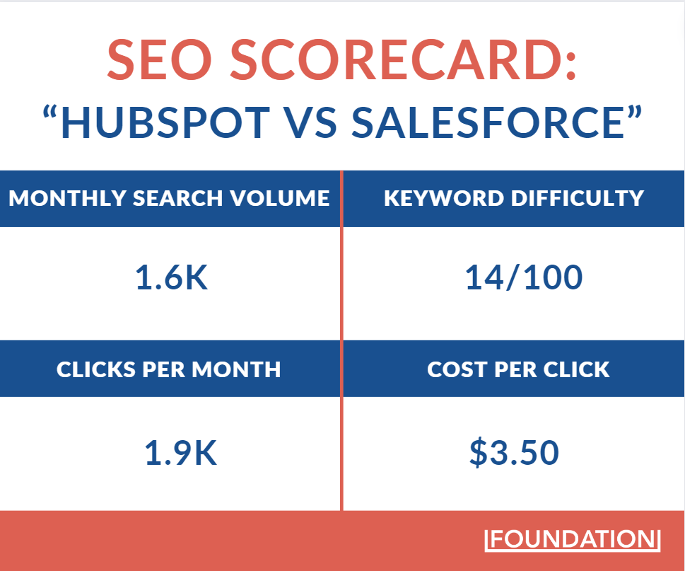
Interestingly, Ahrefs shows that the inverse keyword, “Salesforce vs HubSpot,” only brings in 800 monthly searches — that’s half the amount. But from a search behaviour perspective, it makes sense to target both variations. While the monthly search volume of 800 isn’t as high, it’s still targeting a high-intent audience that’s absolutely worth leveraging.
Investing in SERP real estate for relevant comparison keywords isn’t just about winning a single search but positioning your brand as the go-to choice in a crowded market. Through strategic use of comparison pages, SaaS companies can expand organic traffic to build an SEO moat that lowers customer acquisition costs and enhances brand visibility.
How the Top B2B SaaS Brands Drive Traffic with Comparison Pages
HubSpot, Zoho, and Ahrefs use comparison pages as part of their SEO strategy and to challenge dominant players in their markets. These pages not only elevate their visibility on SERPs but also bolster their brand authority by positioning them as knowledgeable and reliable sources.
Furthermore, by attracting high-intent traffic, comparison pages deliver a more targeted and, hence, more convertible audience to their websites.
HubSpot
HubSpot’s comparison page strategy is a masterclass.
The AI-powered Customer Platform has a library of 71 comparison pages to capture high-intent traffic and significantly reduce advertising costs. This subfolder alone attracts more than 11,000 organic visitors each month.
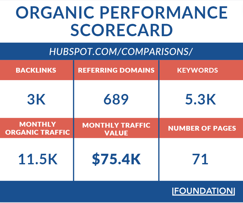
The financial implications are significant:
Ahrefs estimates that the value of this monthly traffic is $75.4k, which translates to an annual saving of approximately $1 million in Pay-Per-Click (PPC) ads.
And remember, this is high-intent traffic for people actively researching and comparing CRM solutions. These consumers are just a few steps away from committing to a platform that best meets their needs.
Let’s take a look at the page HubSpot created to capture the coveted keyword “Salesforce vs HubSpot” that we covered earlier. This specific comparison page attracts over 1,500 visitors monthly, valued at around $6k.
But how do they actually format the page?
Unlike some brands that might adopt a neutral, almost impartial stance in their comparison content, HubSpot takes a bold, assertive approach. There’s no time to play it safe or give equal limelight to competitor features. Instead, HubSpot strategically highlights its strengths and downplays its rivals’ advantages by highlighting that important features are add-ons (at a cost).
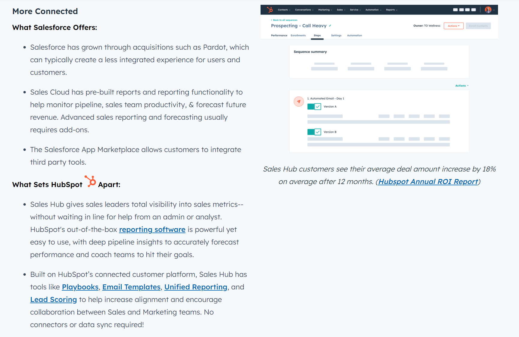
This framing imbalance is also evident in the comparison table.
Where Salesforce might edge out HubSpot in areas like customizable page layouts and contracts, the wins are subtly understated. HubSpot simply places the ❌ in any features missing and a ✅ if features are available.
In contrast, HubSpot’s victories, like the inclusion of revenue intelligence and sales bots without extra fees, are emphasized with visual cues and text.
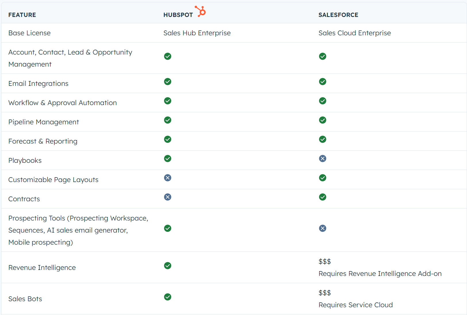
This strategic presentation serves a dual purpose: It underscores HubSpot’s value proposition and ensures any comparative advantages of competitors are less memorable.
The takeaway here is clear — make your opponent’s losses more obvious than your own.
While it may seem counterintuitive, transparency and honesty can actually benefit your brand in the long run. By acknowledging shortcomings and focusing on improving them, you build trust with potential customers and show a commitment to constantly evolving and improving your products or services.
Another important aspect of creating compelling content is to know your audience. Understanding who will be reading your content allows you to tailor your messaging and tone accordingly. For example, if you are writing for a B2B audience, you may want to focus more on data and statistics to appeal to their analytical mindset. On the other hand, if you are writing for a consumer audience, incorporating storytelling and emotional appeals may be more effective.
Zoho
Zoho, another company offering CRM services, takes a more targeted approach to its comparison subfolder. Unlike HubSpot, which makes comparisons against a broader array of competitors, Zoho zeroes in on a handful of key competitors.
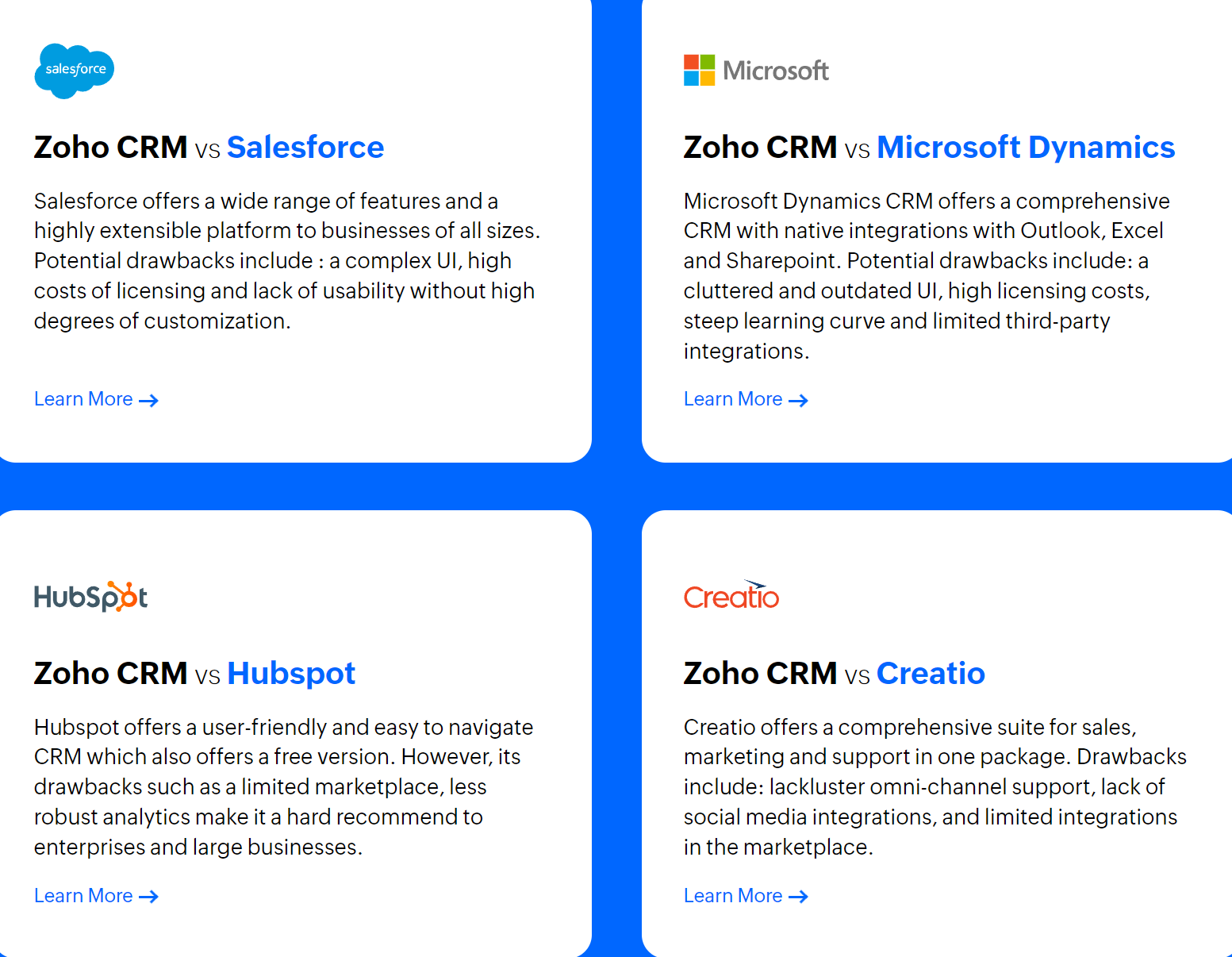
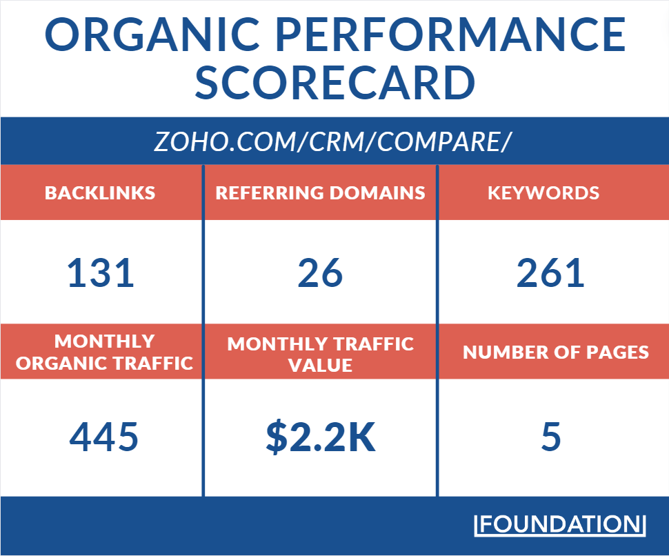
The focused approach appears to limit Zoho’s reach, with the hub attracting approximately 500 visits per month — 445 of those being organic and about 60 through paid ads. But the decision to concentrate on fewer competitors allows for a more in-depth analysis and comparison.
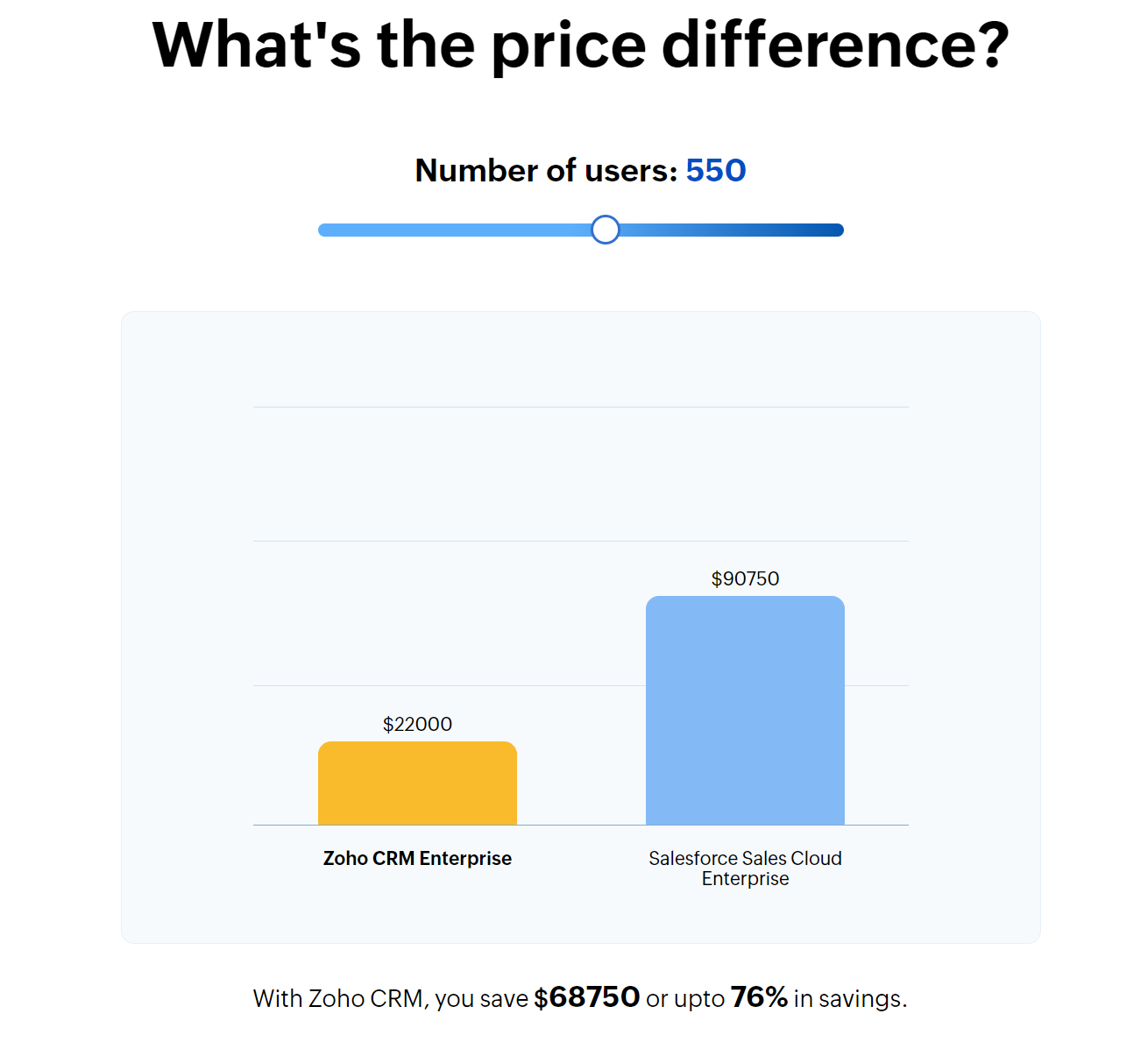
A standout feature of Zoho’s comparison strategy is the inclusion of a price comparison module. This feature allows potential customers to see exactly how Zoho stacks up against its competitors in terms of cost and value. By placing this information front and center, Zoho is able to appeal to the consumer audience that is often looking for the best deal.
In addition to price comparisons, Zoho also incorporates storytelling and emotional appeals into their comparison hub. The company uses customer testimonials and success stories to showcase the real-life impact of their CRM services on businesses. By connecting with customers on an emotional level, Zoho is able to differentiate themselves from their competitors and build trust with potential clients.
SaaS pricing is obviously a hugely influential factor in a buyer’s thought process, so the more transparent you are, the better.
Zoho’s tool directly addresses one of the most critical factors in a customer’s decision-making process: Cost. By clearly illustrating the savings potential of choosing Zoho over giants like Salesforce, Zoho effectively communicates a strong value proposition. This not only appeals to cost-conscious buyers but also to those who seek to maximize their investment in CRM solutions.
Zoho complements its pricing claims with social proof in the form of customer testimonials. This is a powerful tactic that adds credibility to Zoho’s comparisons. Prospective customers aren’t just presented with data and features but also with real-world endorsements from satisfied users.
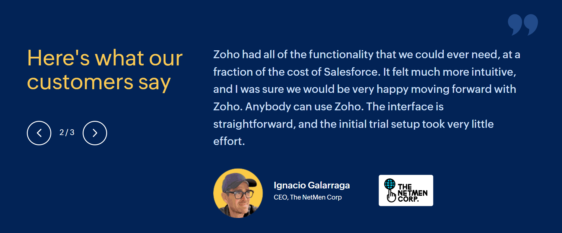
Testimonials serve as a persuasive form of evidence, flaunting the tangible benefits and positive experiences of existing customers. In this case, the phrase “at a fraction of the cost of Salesforce” is particularly powerful.
Zoho’s comparison page strategy is a well-thought-out blend of targeted competition analysis, clear value demonstration through price comparisons, and the strategic use of social proof.
We’ve previously covered how this company takes a tactical approach to winning in the CRM industry (like launching a low-cost option to flank the CRM market). Comparison pages are just another marketing feather in the company’s cap.
Ahrefs
If there’s any company that knows the importance of winning in the SERPs, it’s Ahrefs. A titan in the SEO space, Ahrefs has been battling it out for years against its arch-rivals: Semrush and Moz. For instance, we’ve previously focused on how the company gives away features for free to effectively acquire new customers.
But instead of going for a library of comparison pages to battle these two and other risers in the space, Ahrefs uses a single, One vs Many comparison page type. By doing so, Ahrefs effectively condenses what might otherwise sprawl across multiple pages into a single, potent piece of content.
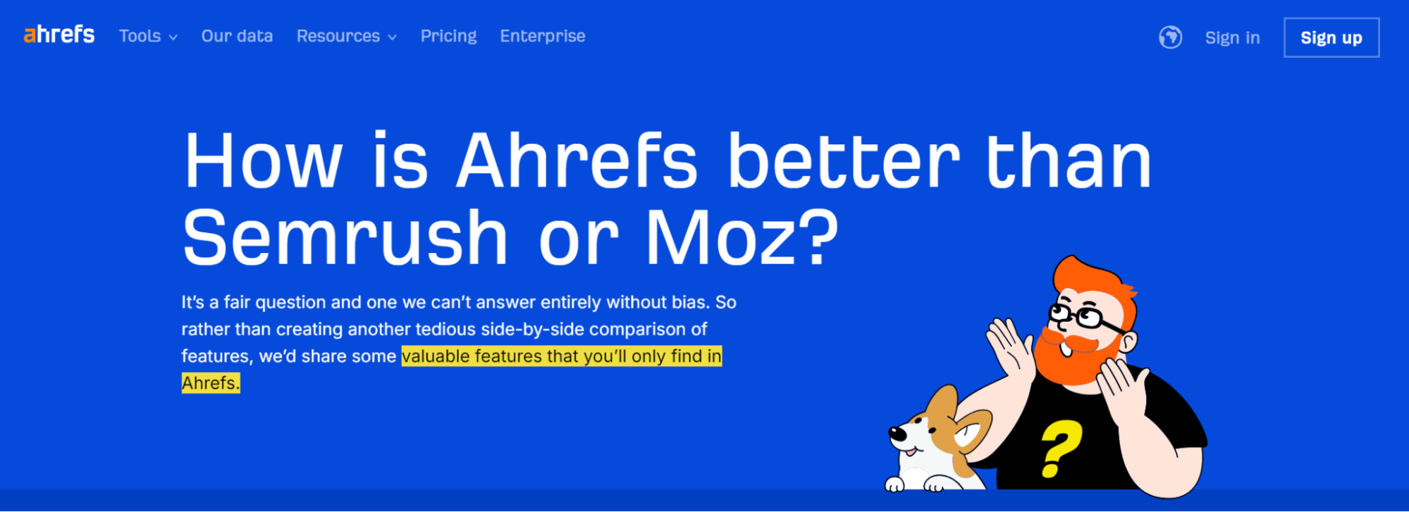
The page commands an impressive traffic influx of nearly 2,000 visitors monthly — that’s an estimated value of $7k. It also ranks in the top 3 SERP positions for 46 keywords, including all variations of “Ahrefs vs Semrush vs Moz.”Interestingly, this stand-alone comparison page is concise from a copywriting perspective, coming in at around 1,000 words.
But it’s not a short read. Ahrefs goes beyond just page copy, letting screenshots and modules do the talking.
Immediately below the fold, there’s a Cloudflare study showing how Ahrefs has the third most active crawler bots, trailing only behind giants like Google and Bing. It also shows how the company leads the charge among active web crawlers in the SEO category. That’s hugely compelling to SEOs: More crawling = more data. \
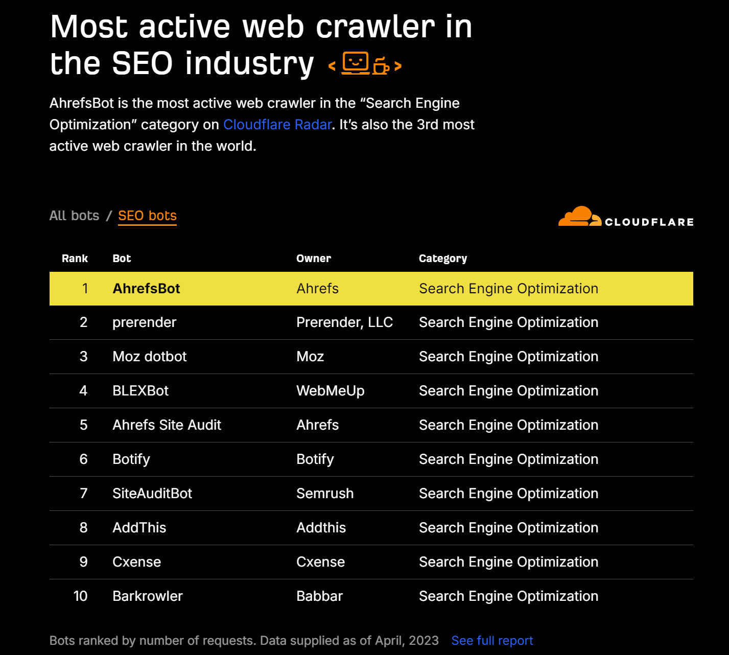
This fact alone solidifies Ahrefs’s position in the SEO echelon, but it’s just the beginning.
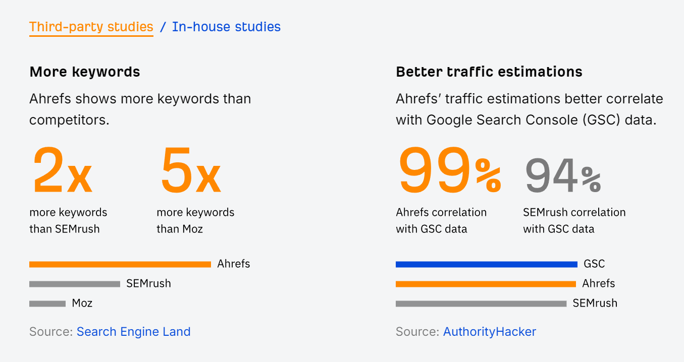
The page then hones in on Ahrefs’s direct competitors — Semrush and Moz — citing third-party statistics from respected brands like Search Engine Land and Authority Hacker, alongside its robust in-house data. This multi-faceted, data-driven approach demonstrates Ahrefs’s superiority with unassailable clarity and precision.
Elevating the comparison further, Ahrefs delineates “16 Unique Things Only Ahrefs Can Do,” ranging from the unparalleled capabilities of its Keyword Explorer tool to its innovative approaches to link opportunity prioritization and multi-URL performance monitoring. This section highlights Ahrefs’s unique value offerings and solidifies its indispensability for SEO professionals.
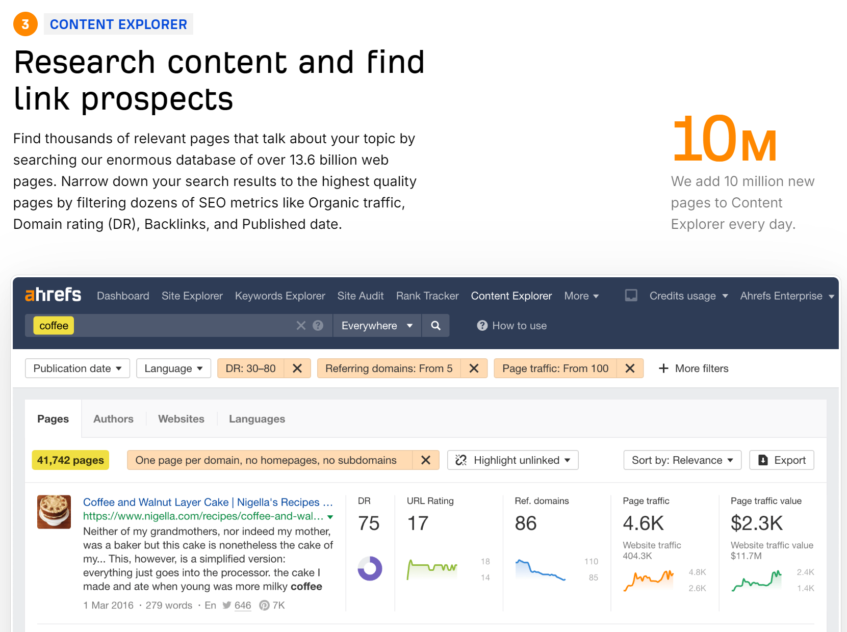
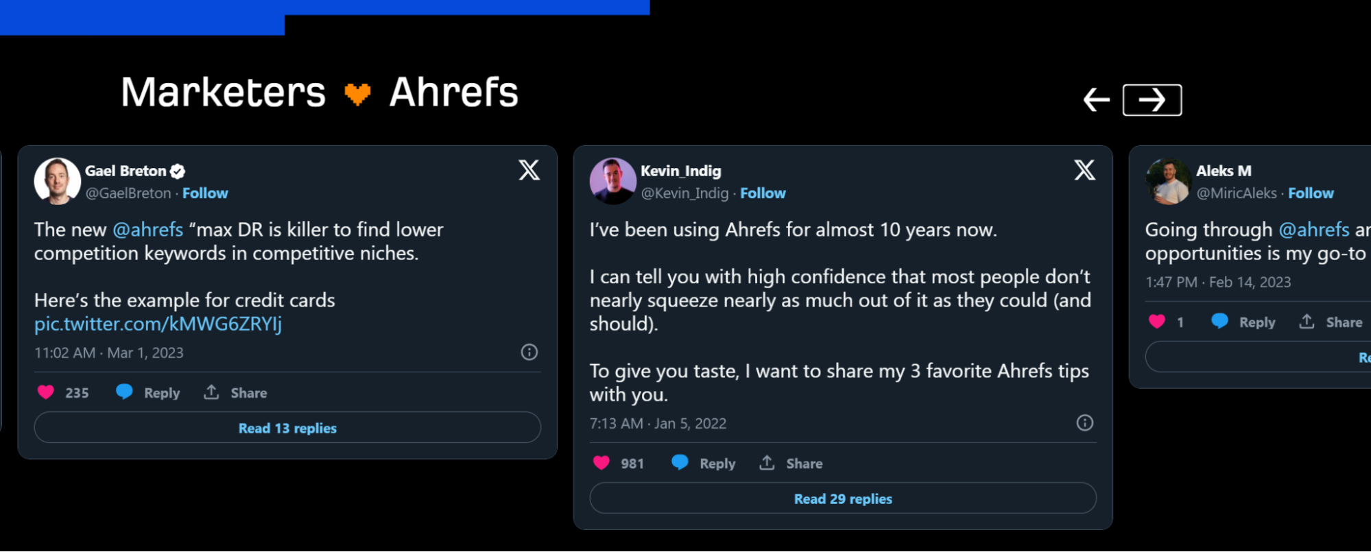
As if that wasn’t enough, the Ahrefs team completes the comparison page with a module featuring Tweets from high-profile users who express their overwhelming support for the product. This user-generated content is a powerful social proof mechanism, encapsulating the broad support and trust Ahrefs has established within the SEO community.
Wrapping Up: How To Do Comparison Pages Right
Wrapping up, it’s evident that SaaS brands can significantly benefit from well-crafted comparison pages.
These pages not only showcase the unique selling propositions of their tools but also build trust through transparency and social proof. By strategically highlighting how their features stack up against competitors, brands can underline their value in a crowded market. Incorporating testimonials or user-generated content, as seen with Ahrefs, adds an authentic voice to the narrative, further persuading potential customers. Ultimately, comparison pages are more than just a feature checklist; they’re a critical tool in a brand’s marketing arsenal, driving ROI by converting visitors into loyal users through informed decision-making.


