Article's Content
Have you ever noticed that nagging feeling of being lost on a website, wondering where to go next? It’s frustrating, right? That’s often due to overlooked or poorly designed footer links.
An ineffective footer disrupts navigation—affecting the overall user experience—and can impact SEO. We’re talking about missed opportunities, decreased engagement, and potential drops in conversion rates.
But there’s hope. We see footer links as a golden opportunity—a way to guide, engage, and enhance the user journey. Let’s explore how optimizing these tiny yet impactful links can significantly affect your site’s performance and look at samples of companies that do footer links well.
What Are Footer Links? The Underestimated Key to Boosting SEO
Often referred to as site-wide or boilerplate links—footer links stand out for their omnipresence across almost every website page. They’re primarily used for internal linking, connecting various parts of your site. Some sites feature external links, but the primary focus is on facilitating easy site navigation. While you might find them located in the header, sidebars, or as floating widgets, their genuine purpose is enhancing the user experience.
The smallest details on a website often make a difference, and footer links are a prime example. Think of them as the anchors of your digital ship; they’re foundational, guiding users seamlessly through your content ocean.
Why Do Footer Links Matter? The Unseen Engine Driving User Engagement
Footer links go beyond just being a rich vein of internal link opportunities—they’re also key navigation markers. And along with aiding user navigation, they play a pivotal role in your site’s organic search standing.
Remember, the linking game isn’t just about quantity but quality. Think of your website’s footer as a multitasker; it doesn’t just sit there. Those links nestled at the bottom of your webpage are more significant than most realize. Google, the ever-watchful sentinel of the web, is keen to discern the intent behind these footer links. Are they there to genuinely guide the visitor, or are they merely an SEO play?
Links meant to enrich the user’s journey are given a thumbs up, earning credibility in Google’s algorithmic eyes. Conversely, links that solely chase SEO gains do not earn Google’s favor. It’s a dance of authenticity versus tactics, and authenticity leads.
Types of Footer Links: Unpacking the Varieties for Optimal UX
Footer links might seem uniform at a glance, but when you dig a little deeper, you’ll uncover a diverse range of types. Dive in as we unpack how footer links vary by industry and the unique role each type plays.
Most Popular Types of Footer Links
Some of the most popular types of footer links are also the most functional, including:
Navigation Links
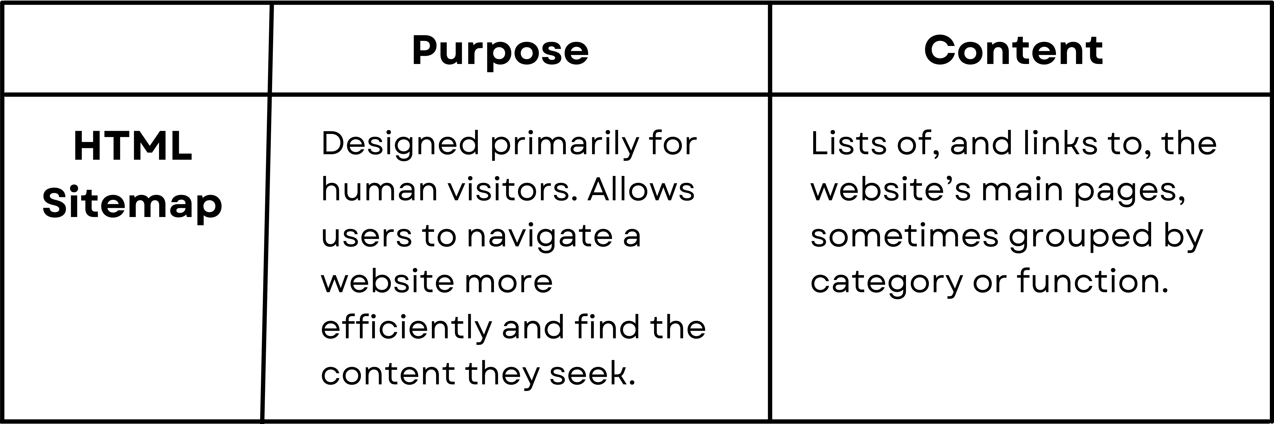
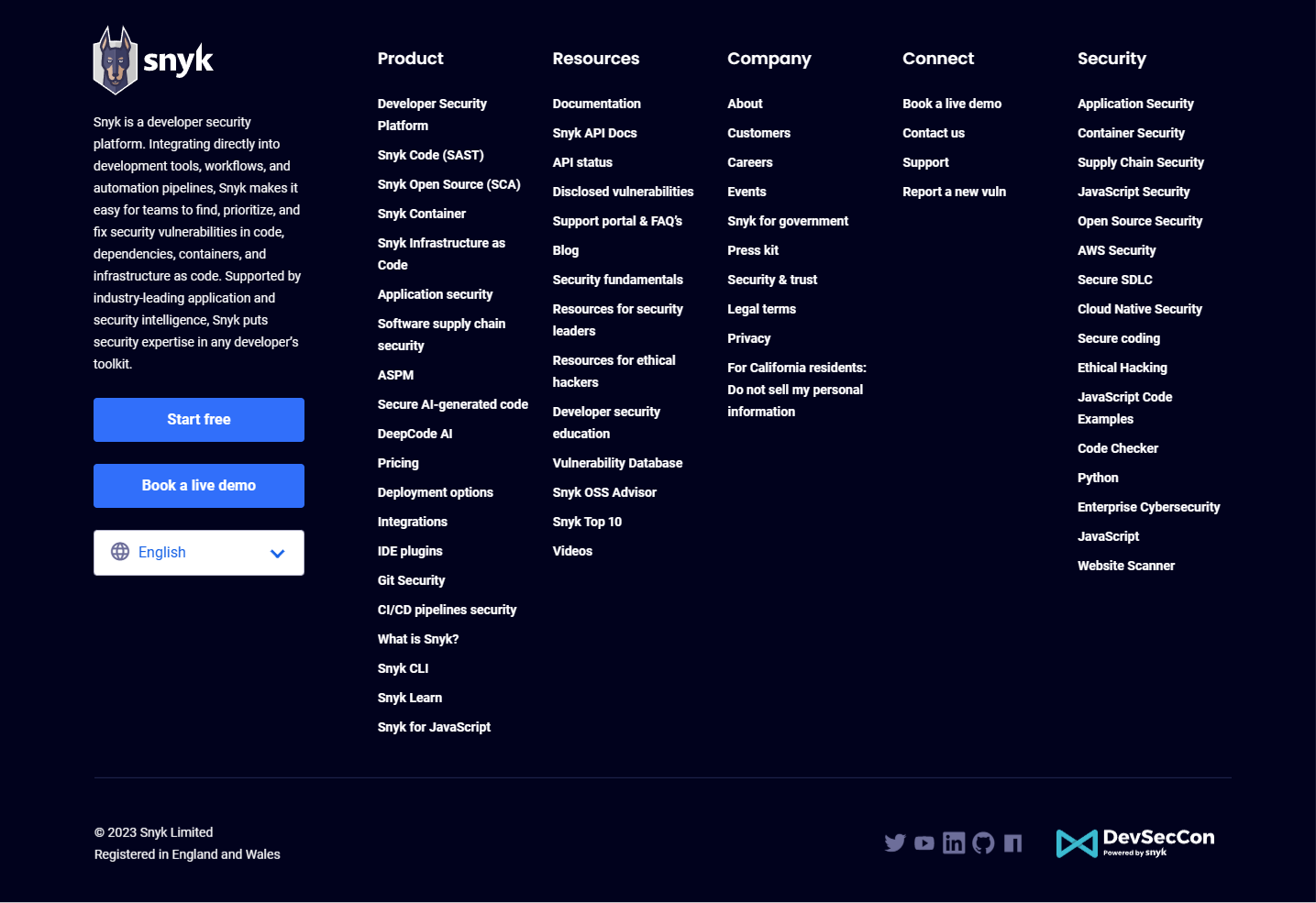
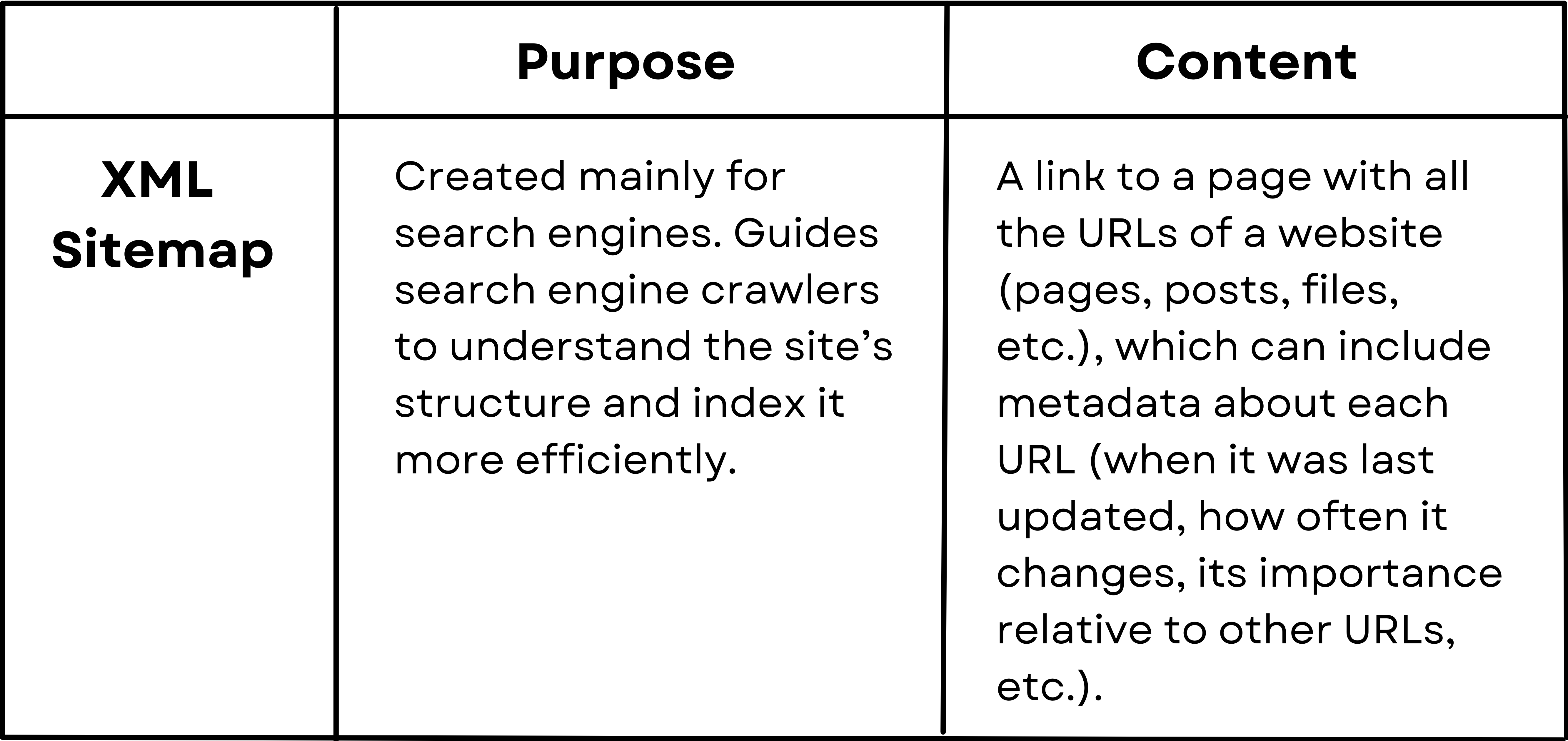
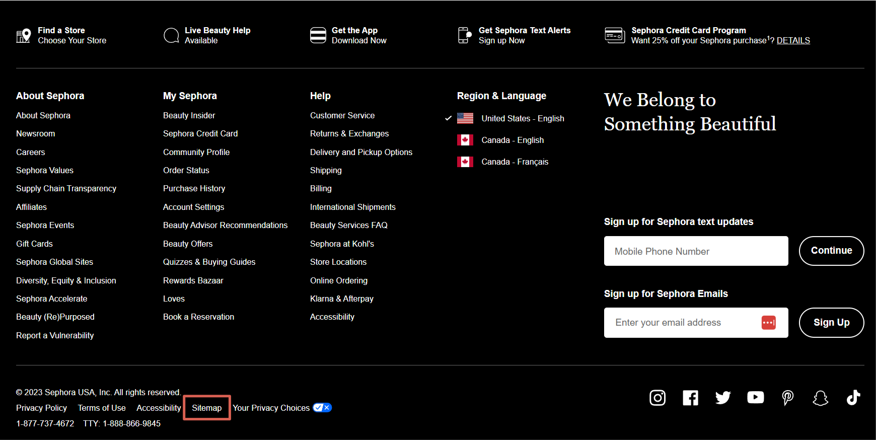
These are links to major sections or pages of the website not covered in the main navigation. Navigation links are typically found within sitemaps. There are two types of footer sitemaps: HTML and XML. Each type serves a different purpose and is used for different aspects of site content:
Example:
Example:
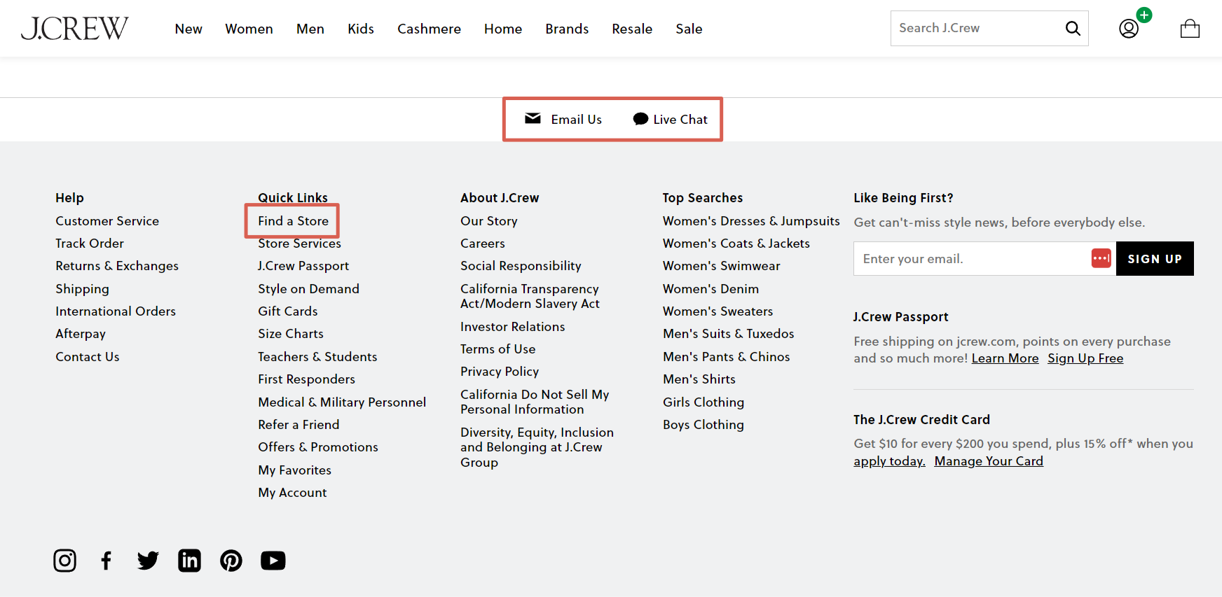
Contact Information Links
These are links to company information, such as phone numbers, an email address or fillable contact form, and a physical address, sometimes with a link to a map or directions.
Example:
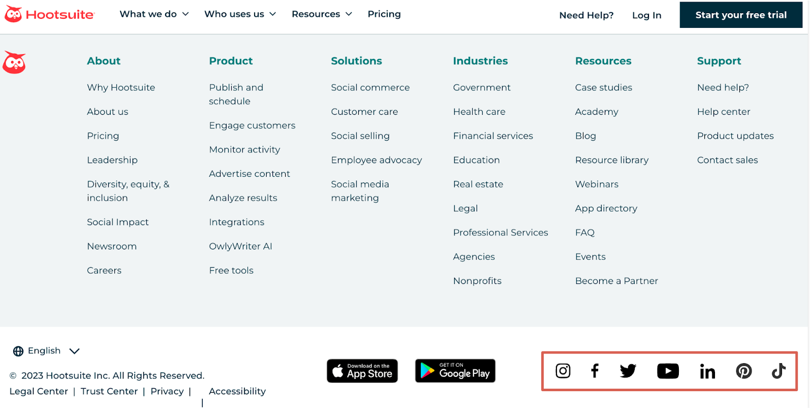
Social Media Icon Links
These are links to the company’s or individual’s profiles on social media platforms, such as Facebook, Twitter/X, LinkedIn, Instagram, etc.
Example:
Sign-up Links
These are links or fillable fields to subscribe to the website’s newsletter or updates.
Example:

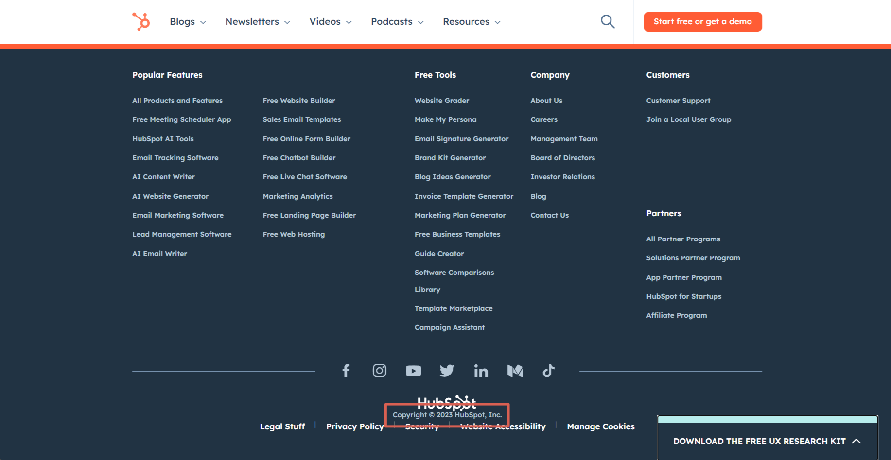
Copyright Information Links
These are links that usually indicate the year and the entity that owns the website, reinforcing the legitimacy and ownership of its content.
Example:
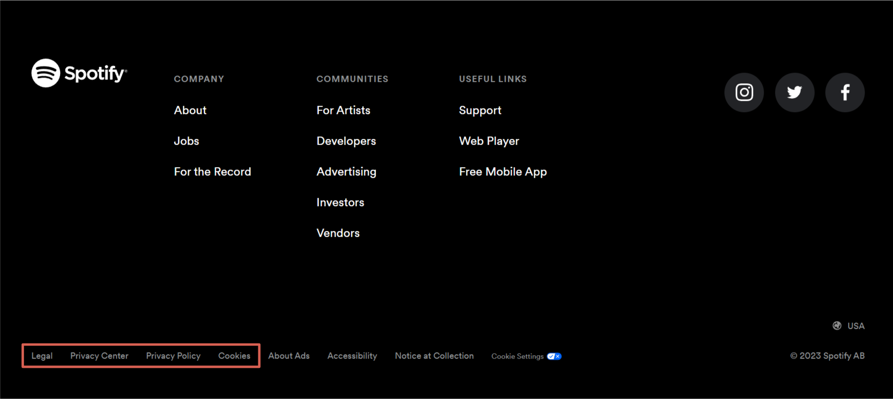
Terms and Policies Links
These are links to essential legal pages, such as the terms of service, privacy policy, refund policy, etc. Often, this includes a link to describe the site’s cookie policies, especially for websites catering to regions with strict data protection regulations.
Example:
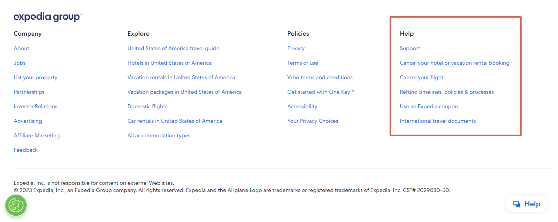
Help, FAQ, and Support Links
These are links to a help section, FAQ section, or support center to help users find answers to common questions or get assistance.
Example:
More Specialized Types of Footer Links
Many individuals and companies also use footer links to help users find additional relevant information, including:
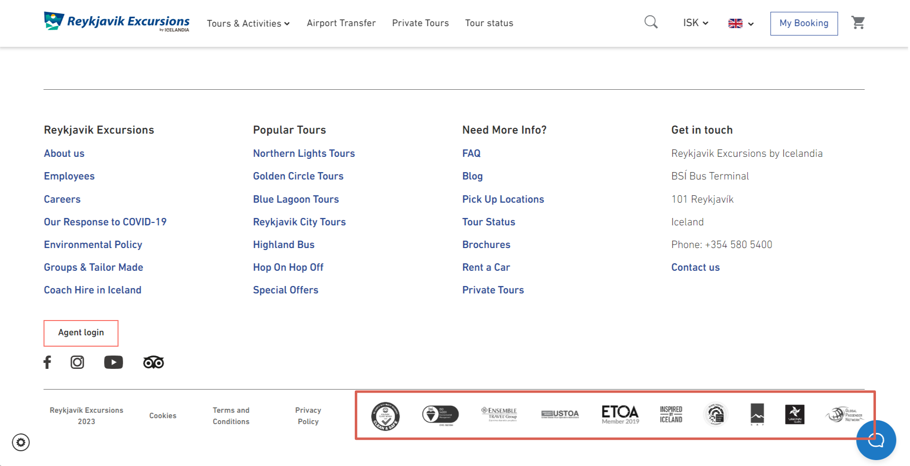
Award and Certification Links
These links show logos or badges indicating awards, certifications, or affiliations relevant to the website or company. They are ideal for startups or brands that strive to be better known.
Example:
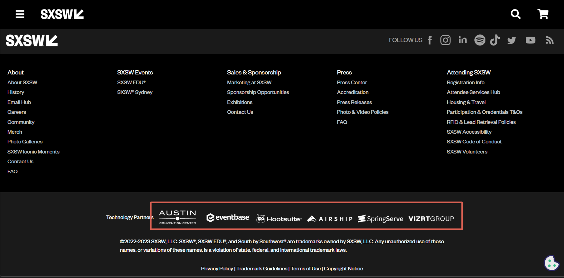
Testimonial or Client Logo Links
These links showcase notable clients or partners and can help build credibility.
Example:
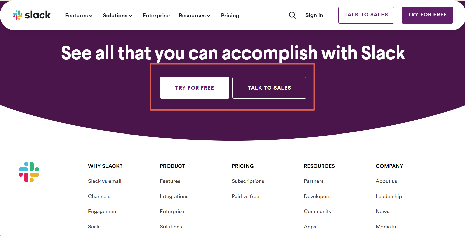
Call-to-Action (CTA) Links
Some websites include a final CTA link in the footer, encouraging users to take a specific action, such as starting a free trial or booking a consultation.
Example:
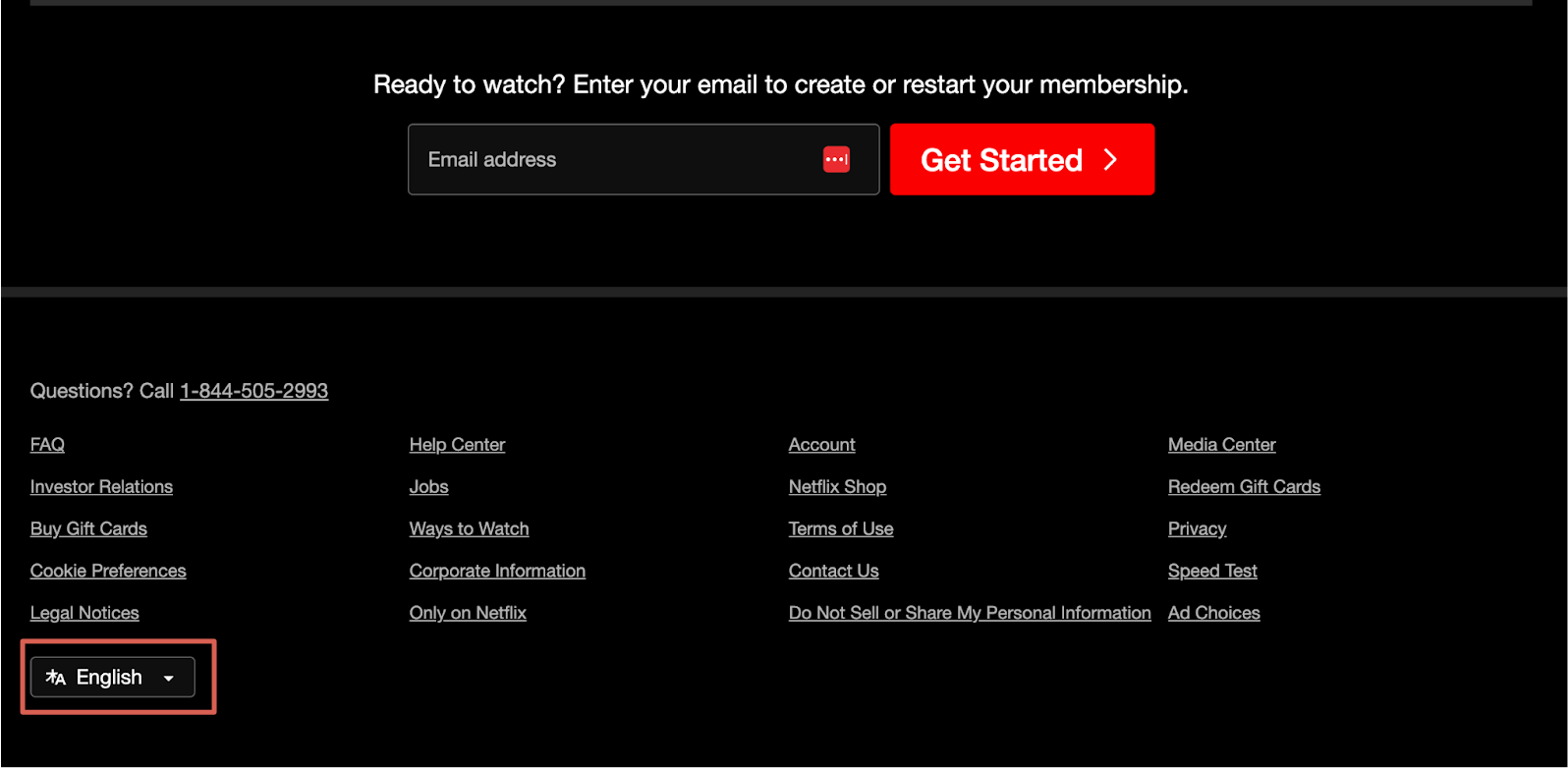
Language and Region Selector Links
These are links usually found in a drop-down menu to select a language or region and can be helpful for multilingual websites or sites catering to a global audience.
Example:
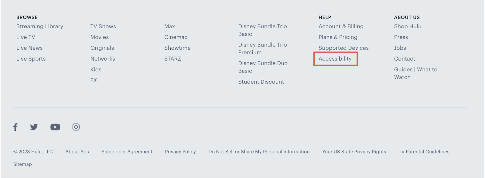
Accessibility Tool Links
These are features or links that improve website accessibility, such as font size changers or contrast toggles.
Example:
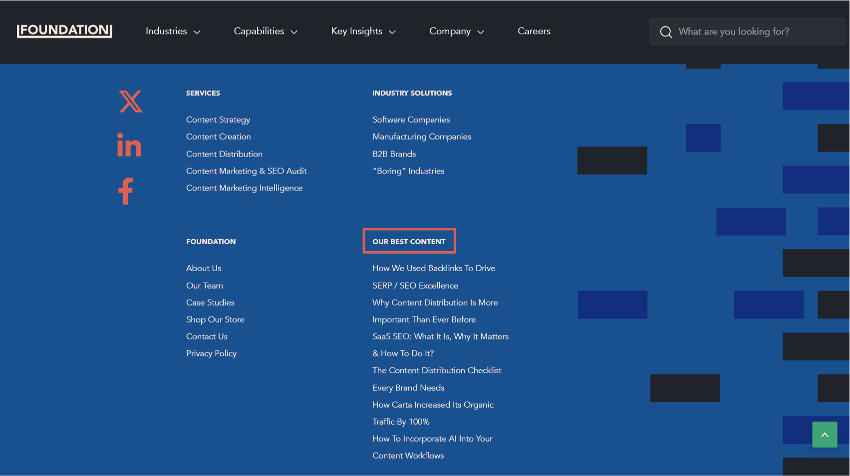
Latest Blog Posts or News Links
Some footers showcase links to recent blog posts, news articles, or updates to keep users informed and engaged.
Example:
Five Must-Know Facts About Footer Links
The humble footer link is a strategic asset intertwined with user experience and SEO potential. To harness the potential power at the base of your webpage, let’s look at the top five essential facts about footer links you need to know:
1. Google Might Downplay Your External Footer Links
To break it down, an external link in your footer packs a different SEO punch than one embedded within the heart of your content. Most times, Google curtails their value, rendering them virtually insignificant. So, direct your footer’s spotlight towards internal links that lead to your site’s pivotal pages.
However, if you do want to place external links in the footer, reserve that space for showcasing affiliated businesses or nudging visitors to your social profiles or trust ratings. It’s a smart move for Google rapport and elevates the user experience.
2. Footer Links May Have Low CTRs
Footer links often fly under the radar—catching users in their final scroll. Most of us only venture to the site’s endgame when our primary search comes up empty-handed. As a result, footer links often have modest click-through rates.
But stuffing your footer with a plethora of links isn’t your ticket to boosting site traffic. The reality is that they’re rarely the main attraction for users. Tread carefully; overloading might compromise your page’s caliber for a mere handful of hits.
3. A “Healthy” Number of Footer Links Depends on the Website’s Nature
While there isn’t a strict number, having hundreds of links on a page (unless it’s something like a whole-website sitemap) might appear spammy. Overloading a page with links might dilute its quality.
Consider this: Your footer graces nearly every page of your site. When you stack it with excessive links, you’re inadvertently dispersing them across your entire platform. This might tip the scales beyond what Google deems a “reasonable link count.” So, use enough links to capture all the content that needs links, but don’t go overboard.
4. Organizing Footer Links is Critical for the Best User Experience
Here’s why organized footer links are not just an aesthetic choice but a strategic necessity:
- User Expectations: Over the years, users have been conditioned to find specific information, like contact details, terms of service, or a sitemap, in the footer.
- Accessibility and Inclusivity: An organized footer ensures that all users, including those with disabilities, can easily access essential pages and tools.
- Efficient Navigation: A well-structured footer lets users quickly locate essential sections or pages, reducing their effort and time.
- SEO Considerations: A website that includes simple navigation will provide a good user experience and will, therefore, rank higher in search engine results.
- Branding and Trust: An organized and professionally designed footer reinforces brand consistency and credibility.
While headers might grab initial attention, footers ensure a lasting impression and efficient navigation.
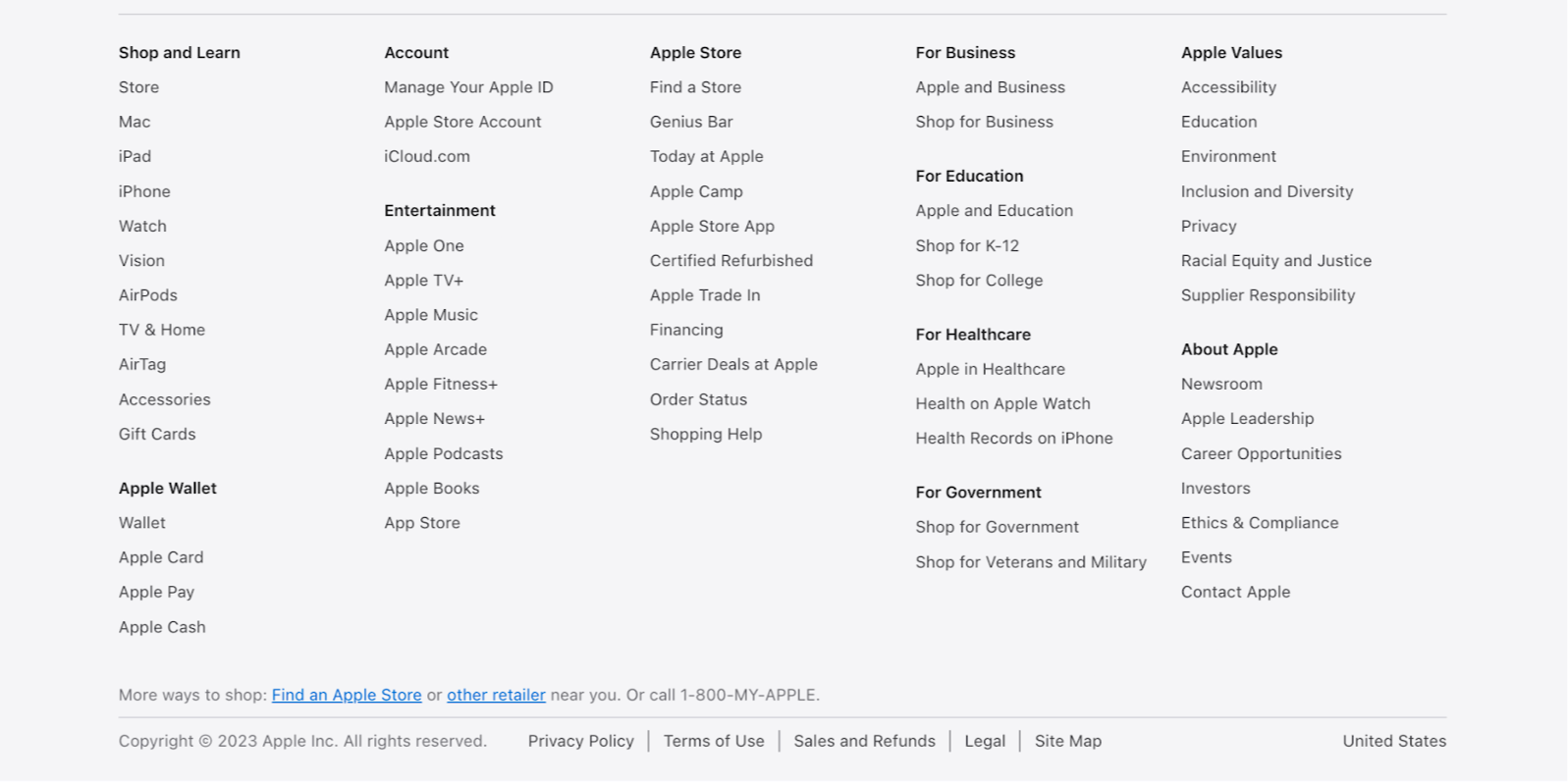
Example:
5. Tailoring Footers for the Mobile Experience: A Must-Do
Mobile browsing isn’t just a trend; it’s the norm. Users demand a slick, effortless mobile experience. Have you got a footer heavy on links? It could become a jumbled mess on a smaller screen without a responsive design.
A responsive footer reshapes and resizes, ensuring it’s tidy and clickable on any device. Plus, Google’s mobile-first indexing rewards those who prioritize mobile design. So, a responsive footer isn’t just about looks—it’s an SEO strategy and a nod to user experience.
Final Thoughts: Elevating User Experience & SEO
A footer’s seemingly subtle links can reshape your user journeys and amplify SEO. Success, though, hinges on genuine intent and adept application. Always champion user-centric design and understanding: a strong start paired with a polished finish makes all the difference in the online world.
For more expert insights in content marketing like these, join our Foundation Labs Inner Circle community today.


