Article's Content
The global SaaS market is currently worth about $3 trillion, and McKinsey & Co. estimates that it could surge to $10 trillion by 2030.
SaaS landing pages play a huge role in the SaaS companies that thrive and those that barely survive. It’s through these landing pages that millions of SaaS buyers find companies that they subscribe to each month and pay millions to for years to come.
Our latest research analyzing keyword and SERP data across more than 50 different SaaS companies and over 25,000 landing pages shows that SaaS landing pages will generate more than $150 million worth of traffic through organic sources in 2024.
But here are the questions most SaaS marketers face when it comes to these pages:
- What landing pages should they create?
- What landing pages convert the best?
- What landing pages drive the most value?
The goal of having the right landing pages on a SaaS website is simple:
More conversions. More traffic. More sales.
We’re going to dive deep into what goes into some of these landing pages and how to create them. We’ll share examples of some of the best SaaS landing pages on the market, along with some insights about what makes these pages great.
Let’s get into it.
The Must-Have Pages For SaaS Companies
Here are the five pages that play a vital role in the buyer’s journey and are crucial for SaaS companies.
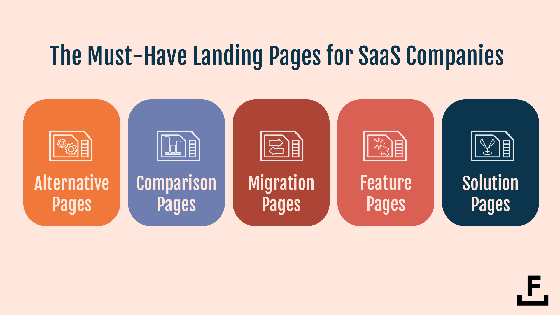
Alternative pages serve to attract prospects who are considering other options in the market and position your product as a better choice.
Comparison pages aid consumers in decision-making by comparing your SaaS product with competitors, highlighting your unique selling propositions.
Migration pages are key for clients switching from another service, showcasing how seamless and beneficial the transition to your product can be.
Feature pages dive deep into the specific capabilities of your product, allowing potential customers to understand the value of each feature.
Solution pages connect the dots between the customer’s issues and your product’s solutions, emphasizing how your software can alleviate their pain points.
Together, these pages create a comprehensive picture of the value your software brings, helping to boost conversions and, ultimately, sales.
Let’s take a closer look at each of these.
Alternative Pages
Every month, more than 5,100 searches are happening for the phrase “Hootsuite Alternatives.”
More than 6,500 searches are happening for “Shopify Alternatives.”
And more than 27,000 searches for “Photoshop Alternatives.”
Why does this matter to brands? Well. If it’s not obvious:
Alternative pages tend to rank for highly converting keywords where people are demonstrating a certain level of intent and awareness by using the phrase alternative. If someone is typing in a variation of any of the following, they are likely looking to purchase a product within that category:
- Zapier Alternative
- Trello Alternatives
- Calendly Alternatives
- Linktree Alternatives
- Or any other SaaS product’s name with the word “alternative” next to it.
Across most Search Engine Results Pages (SERPs) that are associated with “alternative” pages, the competition is significant. The vast majority of these SERPs are filled with brands looking to capture this traffic through paid media, blog posts, landing pages, review sites, and more.
The “Trello Alternative” search phrase, for example, has over 6,600 searches a month, and the estimated cost per click for this phrase is $1.29. Here’s a snapshot of what you see in the SERP:
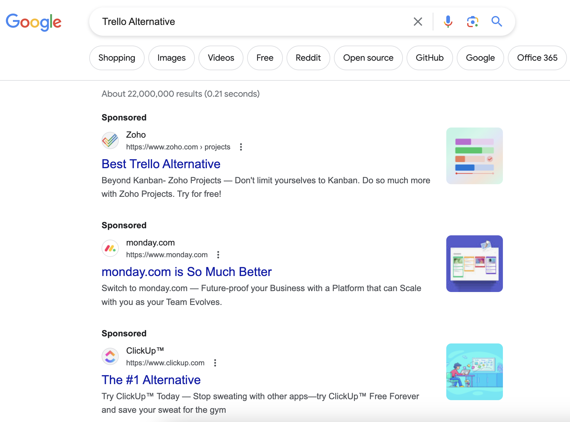
Immediately, you can see ClickUp, Zoho, and monday.com are spending a paid media budget to capture this traffic to their own page.
According to our research, more than 50 brands have spent a paid media budget against the keyword Trello Alternative.
As an example, Wrike is estimated to spend $1,830/month in paid media budget against the keyword “Trello Alternatives” and capture 120–130 clicks for that spend.
They appear to have struck gold here, seeing that they have run ads since 2015 against this keyword to convert people.
But it’s not just about paid media.
In the organic SERP, blog sites like Forbes, Hive, and Proofhub show up for the phrase alongside Trello’s competitor ClickUp (which was also spending for paid traffic).
This goes to show the power and importance of having an alternative page — whether a landing page or blog post — for your SaaS company. By creating a dedicated page that specifically targets customers looking for competitors and alternatives to your product, you can capture valuable organic traffic and potentially convert them into paying customers.
ClickUp is an example of a company that has caught the wave of this opportunity and acted, with over 200 “alternative” pages published on their site as blog posts.
The total monthly traffic value of these pages combines to over $260,000 worth of traffic and ranks for over 50,200 different keywords. The pages currently average 6th in the SERP and cover solutions ranging from Zapier and Monday to Twilio and ChatGPT.
But here’s where things get even more interesting.
The second organic result in this SERP is a post on the subreddit /r/Selfhosted titled: Trello Alternative.
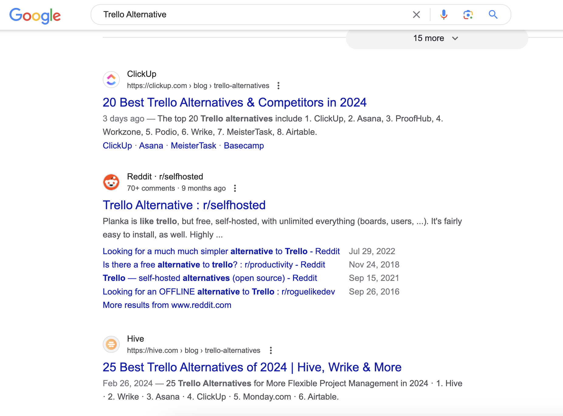
I’ve talked about the power of Reddit in the past as a marketing channel, and its ability to now show up in the top SERPs presents a huge opportunity for brands.
As communities become more and more trusted, the rise of Reddit-related content is no longer a risky idea — it’s a real opportunity for brands looking to generate traffic long term.
Here’s the top reply to that Reddit post:

Two words. Three links.
That’s all the poster wrote, and now these brands are generating third-party validated traffic from the SERP and gaining attention inside of a subreddit that has over 312k subscribers.
So, how do you make an alternative page that’ll compete?
The most popular alternative page format follows this brief structure:
| SaaS Alternative Page Content Brief
Introduction:
List of Alternatives:
Detailed Description of Each Alternative:
Conclusion:
Visual Elements:
Navigation and Layout:
|
Let’s look at another must-have for your landing page arsenal.
Comparison Pages
One of the most common questions I get asked is:
What is the difference between a comparison page and an alternative page?
The difference from a context lens is quite significant.
Someone who goes to Google and types in:
- Slack vs. Teams [6,600 searches/month]
- ClickUp vs. Trello [880/mo]
- Salesforce vs. Hubspot [1,900/mo]
Is someone with a different search intent than someone who types:
- Slack alternatives [6,600/mo]
- ClickUp alternatives [1,900/mo]
- Salesforce alternatives [1,600/mo]
Someone doing a comparison-based search query is looking to understand feature vs feature how two different brands stack up against one another.
Someone doing an alternative-based search query is looking to understand their options and see what else is out there beyond a certain brand.
Are they both valuable search terms? No doubt about it.
In a study conducted by the team at Grow & Convert, they found that the conversion rate on content that was “comparisons + alternative” was the highest. The second highest conversion rate was for pages that compared two products against each other:
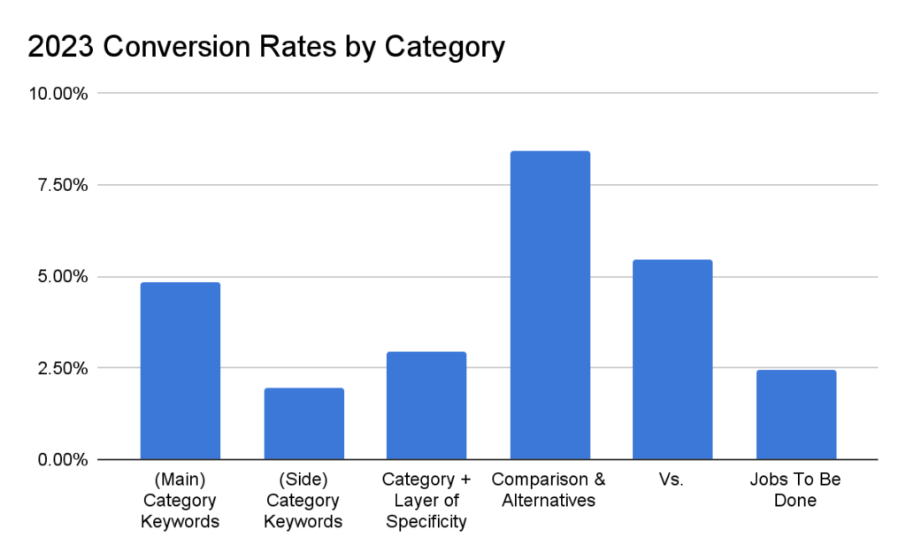
As an example of “vs” pages, ‘Trello vs. Asana’ as a search phrase generates 3,600 searches a month, which is almost half of the total number of searches for “Trello Alternatives.” We love Alternative Pages as a growth lever for SaaS.
All that being said…
Creating both page types should be part of your marketing mix.
As you plan your use of vs pages, keep in mind that there are going to be more variables at play in the development of these, and you’re going to need more of them.
Why?
Because these pages compare two or three products in detail across a number of specific feature sets.
The number of people looking for Trello vs. popular competitors such as Jira, Clickup, Slack, Monday & Asana adds up.
So, how should brands react to this?
It’s simple: Create all the pages.
We’ve worked with SaaS companies to develop a series of pages that go deep into comparing their product with competitors. The success we’ve seen at ranking these pages in the SERP is significant because it’s a strategy still overlooked by many brands due to internal stakeholders’ resistance to being compared directly against the competition.
But here’s the thing:
Whether you like it or not… Your customers are looking for these types of comparisons.
And it’s better for you to own the narrative than a competitor.
You can create a collection of comparison pages that showcase all the different products that your brand competes with and showcase your solution’s benefits.
In the example below, you can see that Hubspot has launched more than 33 different comparison pages:
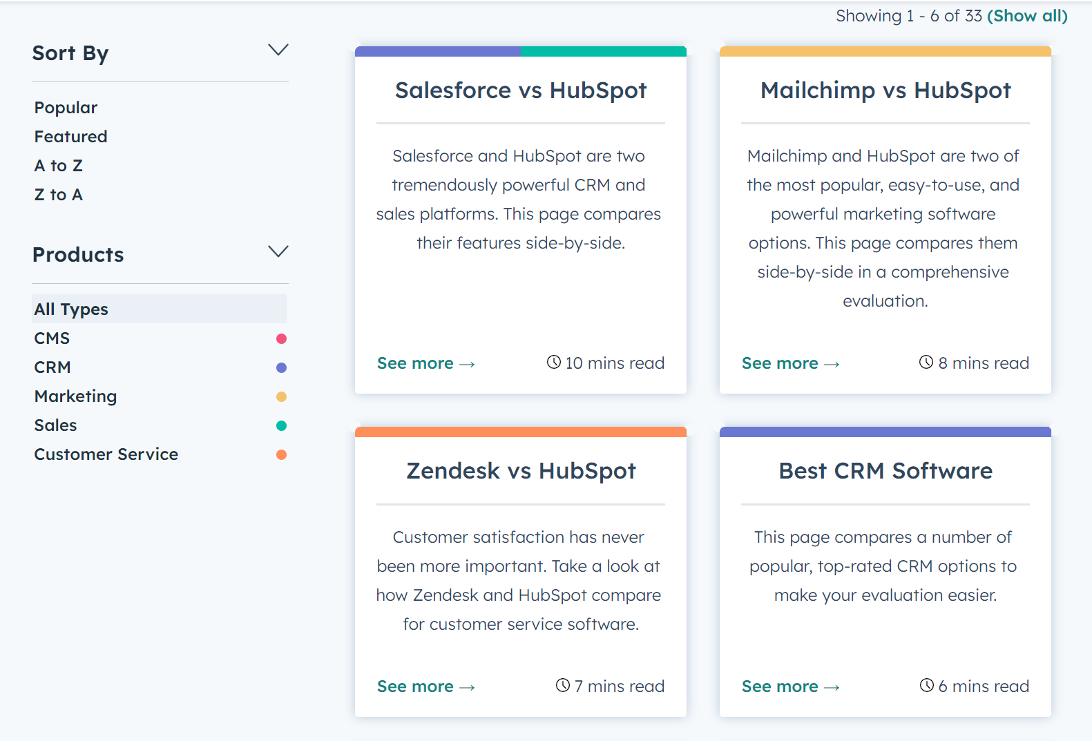
In a crowded industry, developing a landing page dedicated to showing all the different brands you compete with is a great strategy for building a bottom-of-funnel presence in the SERP.
And here’s a pro tip:
Those who don’t convert today are not lost.
Don’t sleep on running retargeting and remarketing ads at individuals who check out your comparison pages so that they can become converted leads down the road.
Software Migration Pages
Every single day, churn happens.
Every single day, hundreds of people go to Google and start the process of learning how they can migrate from one tech stack, tool, or SaaS product to another.
The SERP data doesn’t lie:
- Over 200 people are moving from Evernote to Onenote
- Over 500 people from Lastpass to Bitwarden
- Over 2,400 from Lastpass to 1Password
Out of all the money pages we’re talking about, I’m convinced that Migration pages are the easiest to rank for. The content that shows up in the SERP for most of the various queries associated with “switching” or “migrating” tend to be support docs and landing pages that are very technical in nature.
Brands who take an approach that blends both the editorial nature of great SEO content and the technical nature of a user looking to make the move are brands that dominate the SERP.
Migration pages should be owned by brands on both sides of the coin.
If you can create pages that teach people how to migrate from your solution to a competitor, you’re going to OWN the narrative about your business.
GoDaddy’s email migration service to Microsoft 365 is a great example of this. Even as GoDaddy users grow their business and expand to the point where they need to move on from their domain-based email, the company still has an opportunity to engage them.
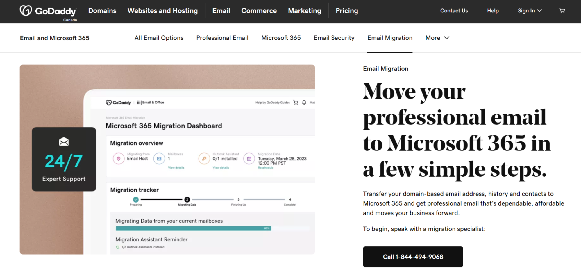
This page helps them capture the attention of and potentially retain the 200 people per day who search “migrate from GoDaddy to Office 365.”
Feature & Solution Pages For SaaS
Every SaaS company should have a series of pages that talk explicitly about the things that they offer.
These pages include “product pages” or “feature pages,” as well as “solution pages.”
The goal of these pages is always the same:
Describe the thing that you offer — that people want — and be optimized to increase the likelihood of a conversion: demo request, free trial, or purchase.
You can see an example of a series of product pages in this navigation for the brand Clio:
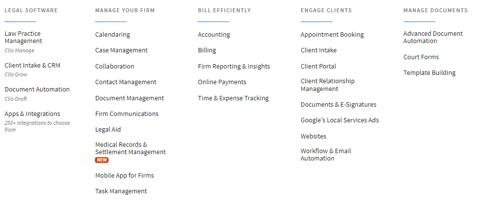
Clio has 32 product pages on their site, each sharing the features and benefits of the Clio suite in more or less the same way. Here’s what they include:
- A captivating tagline, compelling introductory copy, and two CTAs.
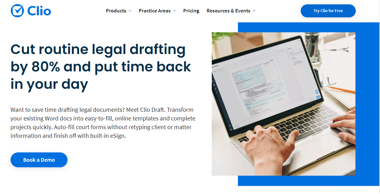
- A summary of the key features with internal links, a short video, and a repetition of the core value proposition.
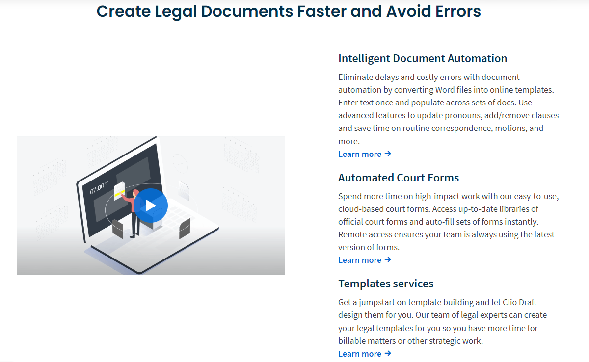
- Quotes from current users and a list of prominent legal firms that use Clio to draft their documents.

- A module featuring a gated asset on legal document automation to move interested people further down the funnel.
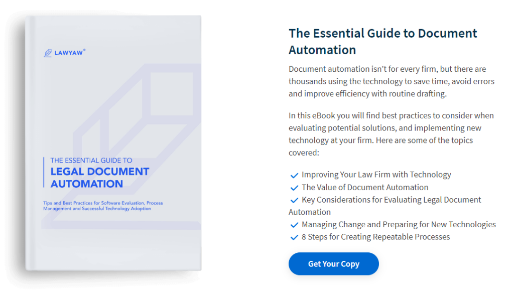
These pages are straight to the point from a content lens and do a great job of prioritizing the primary keyword in the H1.
In fact, the combined search volume for all the pages published by Clio is 152,000 annual visits.
That’s a lot of traffic.
If just 1% of those visitors convert, that will generate 1,520 new customers a year on the back of their feature pages.
It’s no wonder Clio was recently valued at $1.6B.
Money pages generate money. This is exactly that.
Don’t Wait — Invest in Money Pages Today
The best SEO campaigns and initiatives incorporate these five types of landing pages in their recommendations for brands. At Foundation, we work with SaaS companies every single day who are looking to increase their revenue from organic and drive additional revenue from content.
Alternative pages.
Comparison pages.
Migration pages.
Feature and solution pages.
All make sense for a full-funnel content strategy.
Why?
Because these pages drive REAL revenue and REAL profits.
If you know a SaaS company struggling to get the results they want from SEO, this playbook is one that can drive massive returns. Send them this piece, or tell them to give Foundation a call. We’re one of the top SaaS marketing agencies on the market and we’d love to chat with more ambitious brands.


