
Article's Content
Article's Content
What are the best practices for SaaS web design?
That’s the question I set out to answer after stumbling on SaaS site, after SaaS site, after SaaS site… That looked pretty much the same:
I’m going to research this more but it really feels like most SaaS sites look the same.
There’s clear benefits here:
Trust / Usability / SpeedBut it drops the ball when it comes to:
🎤 Establishing a brand voice
❤️ Showcasing your culture
🚀 Immediate differentiation— Ross Simmonds (@TheCoolestCool) January 9, 2019
Understanding best practices can be a great way for web designers (and SaaS founders) to think about their own brand presence. It’s an approach Andy Crestodina took a few years back when analyzing web standards for the top 50 marketing sites. It can also help designers, strategists and founders plan their design initiatives in the sense of wireframes and identifying what key design elements need to be on their homepage.
The Nielsen / Norman Group published one of the first pieces of documentation around Web Design Standards and defined three levels of standardization:
- Standard: 80%+ of sites use the same approach
- Convention: 50 – 79% of websites use the same approach
- Confusion: 49% or fewer websites use an approach
While I originally had a lot of frustration with the lookalike SaaS brands; the further I looked at the reasoning for following design standards and best practices the more I understood the benefit of consistency. Some of the benefits that come with following design web standards include:
- A sense of security & trust when seeing common design elements
- Knowing exactly where to go when you need something (ie. Home via. logo click)
- No uncertainty around new icons, buttons and design elements
- No key elements (ie. Get a demo) missed
All of these things can make the user experience smoother and more intuitive.
But there’s a lot of things in the SaaS space that seem to be replicated without any good reason.
So to better understand SaaS Web Design Standards we took the top 100 sites from SaaS1000.com in January 2019, to create a data set that showed us what things had become standards, what were conventional and what was a coin flip.
Here’s a closer look at the SaaS design best practices happening in 2019:
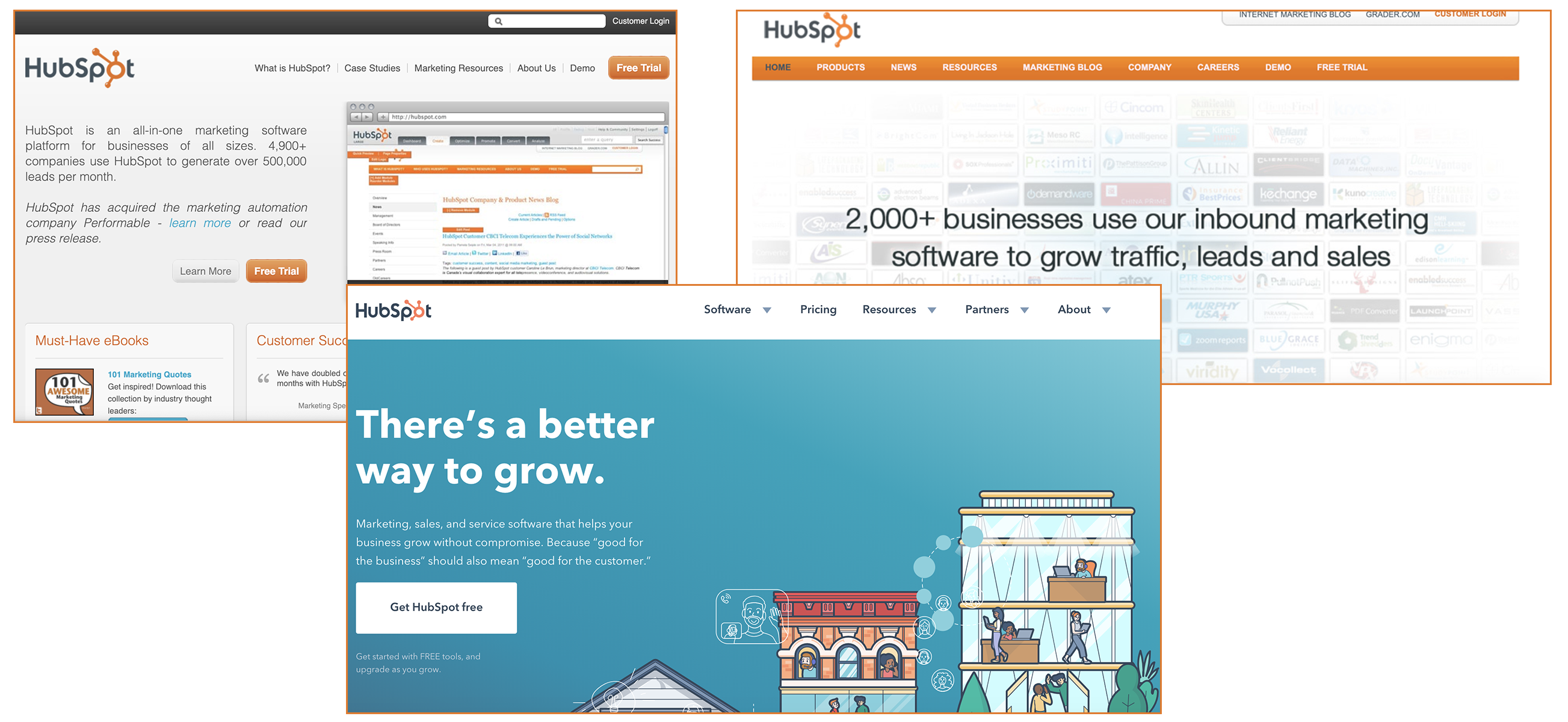
Brand Logos Are Always On The Left Hand Side
![]()
So, you’ve decided to create a logo (or update your existing one) and are wondering where on your website to place it. The placement of your logo on the top left of a website is a common design best practice. It’s an approach that most designers leverage inside of SaaS and outside of SaaS. It’s a logical choice recognizing that most people in North America view a site from left to right.
But sometimes (in our research; once) a designer decides to place the logo somewhere else. While we didn’t see any sites place their logo on the right; we did find DataDog who placed their logo directly in the middle of their site:
![]()
In a logo research study, the folks at Venngage found that 35% of people preferred text dominant and horizontal style logos for tech companies.
Most SaaS Websites Are Mobile Responsive
We live in a mobile world.
Mobile responsive sites are a great way to ensure you don’t deliver broken experiences for people on a desktop or visiting on mobile.

In 2018, 52.2% of all worldwide online traffic was generated through mobile phones. That’s why it’s so great to see that most SaaS companies are investing in a responsive design & mobile landing page best practices rather than solely building for desktop. It’s worth noting that mobile responsiveness is critical for web accessibility as people with certain disabilities rely solely on their cellphones to engage with websites. You can always use a web accessibility tester to check whether your site is mobile responsive.
Video Can Be Found On A Little Under 55% Of Sites

Whether it was a demo or a case study in the form of video on the homepage for these sites more than half of these sites took the approach. The majority of SaaS companies leverage video but not by a significant margin to make it considered a best practice.
The legacy cost expectations that come with the production of a high-quality video may still be holding brands back from this investment. Illustrated product explainers surged in popularity a few years ago and become a popular service bought through sites like Fiverr and Upwork. Today, the demand for these types of videos is still quite high (more than 14,800 searches for explainer videos per month) yet only a little over half SaaS companies use them.
There’s Always Primary Call To Action Above The Fold

There’s a clear best practice in the SaaS community that your call to action driving people to do something needs to be above the fold. More than 90% of all sites that were included in this SaaS Design research had a button or call to action above the fold.
The Placement Of The Call To Action Varies
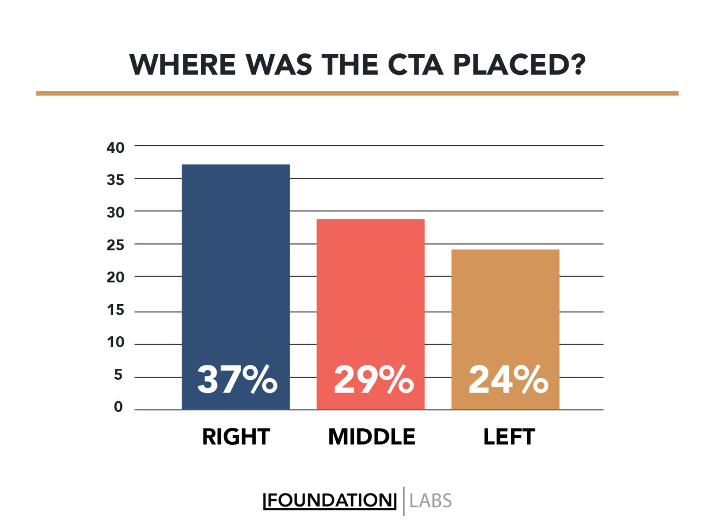
Across all of these sites there was very little consistency in where the call to action was placed. Some of them were placed in the far left of the web page, some were drop dead in the middle and others were far off to the right. The best practice when it comes to placement of the CTA seems to be a complete coin flip amongst SaaS companies.
What Colors Do SaaS Companies Use For Buttons?

When analyzing the various call to actions there was a clear trend towards green and orange buttons.
Get Started Is The Most Popular Call To Action
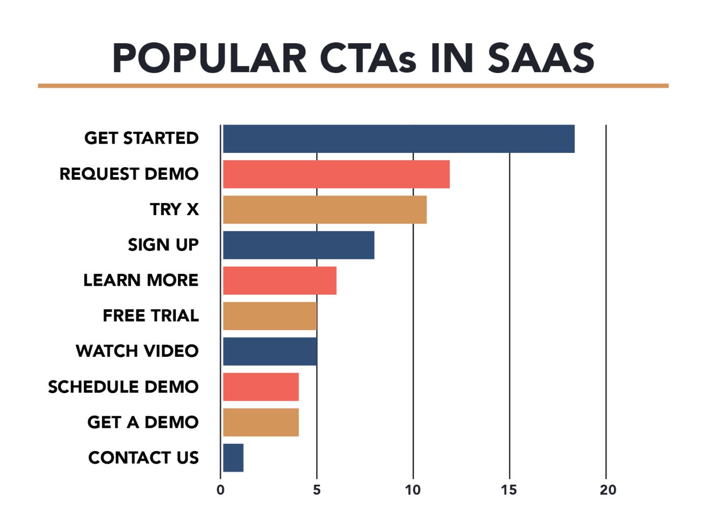
The sites we reviewed that have a call to action typically have a clear thing that they want people to do. The majority of them use action-oriented language and push the visitor to do something that pushes them further in the funnel.
Some variations include:
- Schedule A Demo
- Request A Demo
- Get A Free Demo
- Get X For Free
- Get Started
- Try X
The most common words + phrases within the call to actions tended to be: Free, Demo, Get, Started, Try X and Request… Some of these words showed up together (ie. Free Demo or Try X For Free) but using a combination of these words tend to show up most in SaaS primary CTAs.
Using A Light Background Is Best Practice

It’s not common to see a site that has a black background in SaaS:

Most of the sites (92% of them) used white or light colors as the primary background for their sites.
Using Real People Is Only Used by 56% Of SaaS

The placement of real people on the homepage was more than half. In comparison to the illustrations, the placement of real people on the homepage was usually NOT found in the main section of the site. Sometimes they appeared directly above the fold like the image above but most times it was further down the page in the form of a testimonial, case study or reference to a feature.

It was also great to see quite a bit of diversity in the image selection. The only thing missing was seeing a similar level of diversity on those “Our Team” pages but that’s a topic for another time.
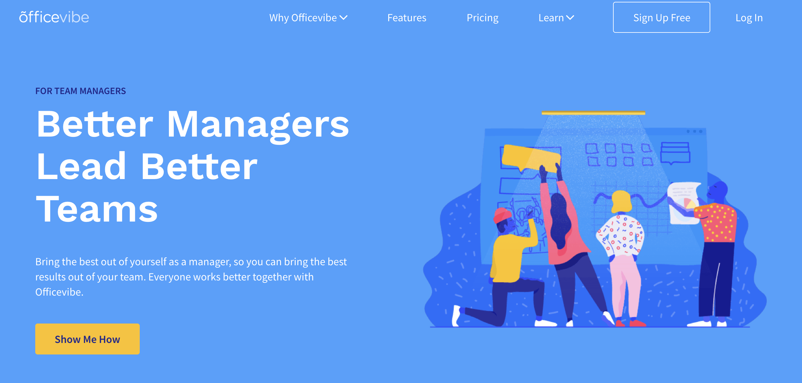
Custom Illustrations Are Very Common (70%)
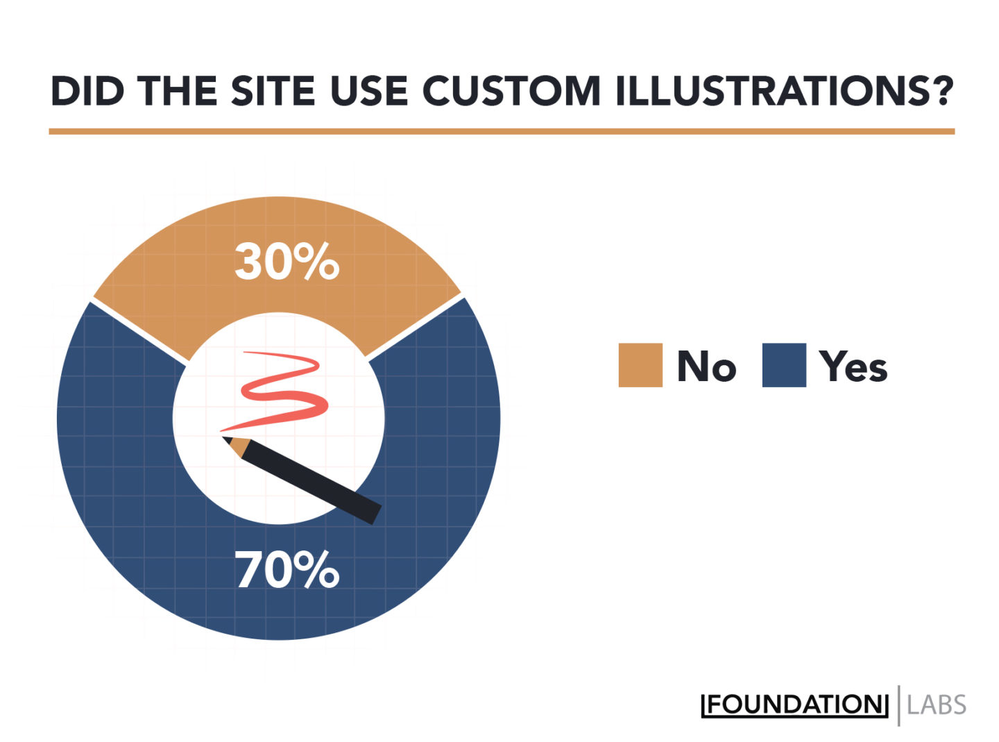
The rise of custom illustrations have swept the SaaS community by storm. It’s something that for the last 3 years has been popping up on site after site after site. Our professional opinion is that this is a trend but it’s only a few percentage points off from becoming a best practice.
Here’s a snapshot of some of the sites and their illustrations:

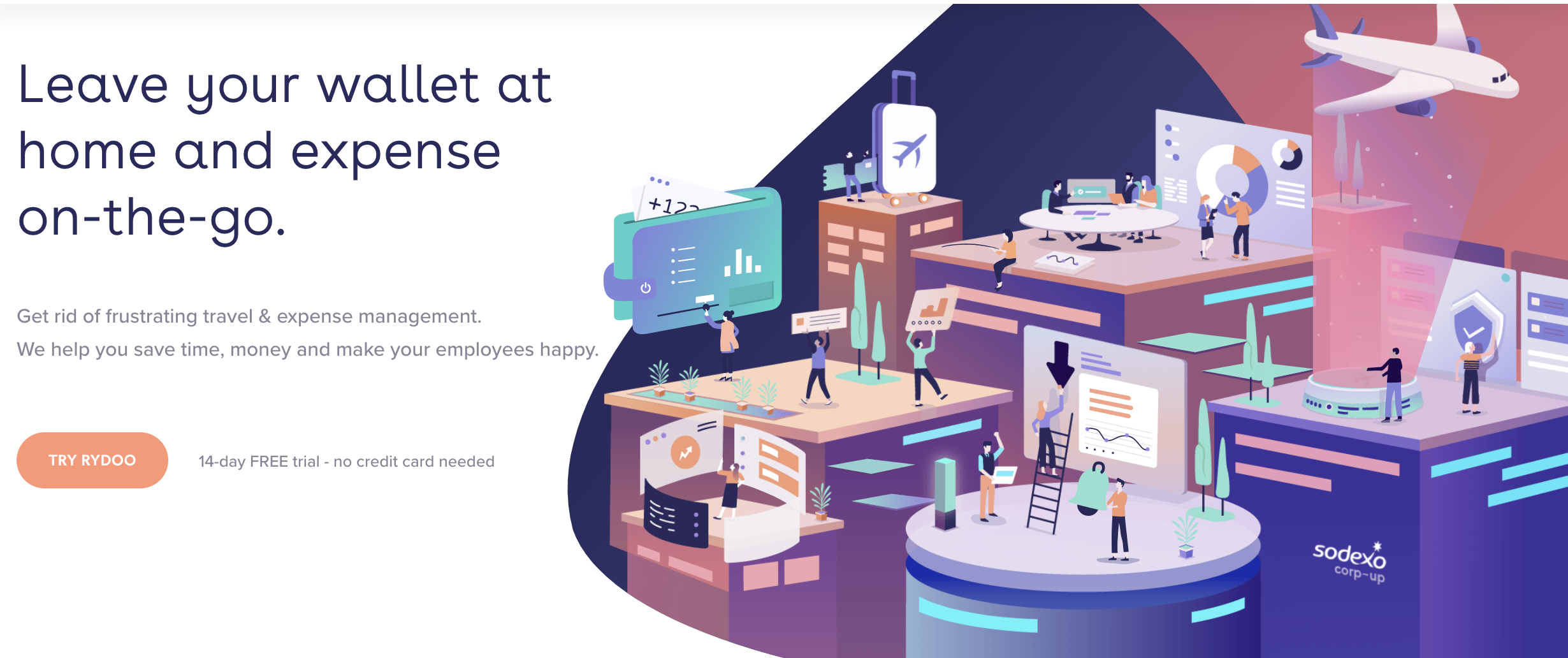
This is an interesting trend.
What do you think: Does this approach to SaaS web design help startups stand out or does it result in them blending in? Does it matter? Does it give off a sense of trust?
Half Of The SaaS Brands Use A Live Chat Tool

The rise of live chat and conversational marketing has been a fascinating trend to watch. As this idea of embracing real time conversations with prospects (or using bots) continues to catch traction it’s clearly becoming popular amongst B2B SaaS companies.
Our research found that nearly 50% of SaaS sites have a chat box in the corner ready to be engaged with. Across most of these sites the services being used were Intercom or Drift.

So Should You Follow The Standards?
It depends.
Experimenting with website design is a great way to uncover something before the rest of the industry. That said, the risk of design experimentation is that users could find the entire experience broken and poorly created. On the flipside, doing everything to the standards that are already being used across SaaS websites around the world you might very easily blend in.
Here’s a list of website design tips to do if you want a site that isn’t like everyone else:
- Don’t use flat illustration as an abstract representation of your brand
- Don’t use dark orange or yellow buttons on your homepage
- Don’t left align your value proposition on the site
- Place your logo in the middle or on the right
- Use a dark background for your site
Does your site currently meet these standards? Did anything here surprise you?