
Article's Content
Article's Content
What are the best practices for SaaS web design?
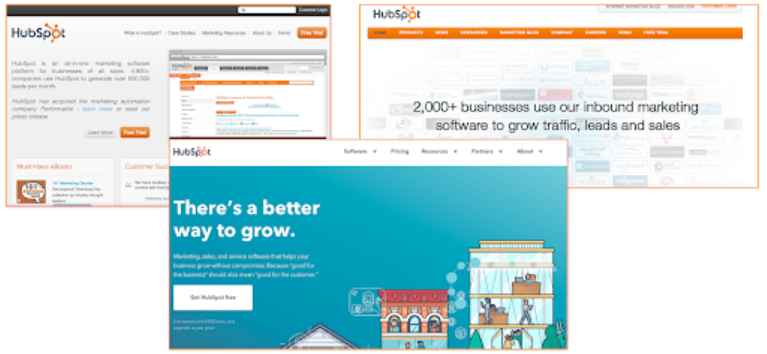
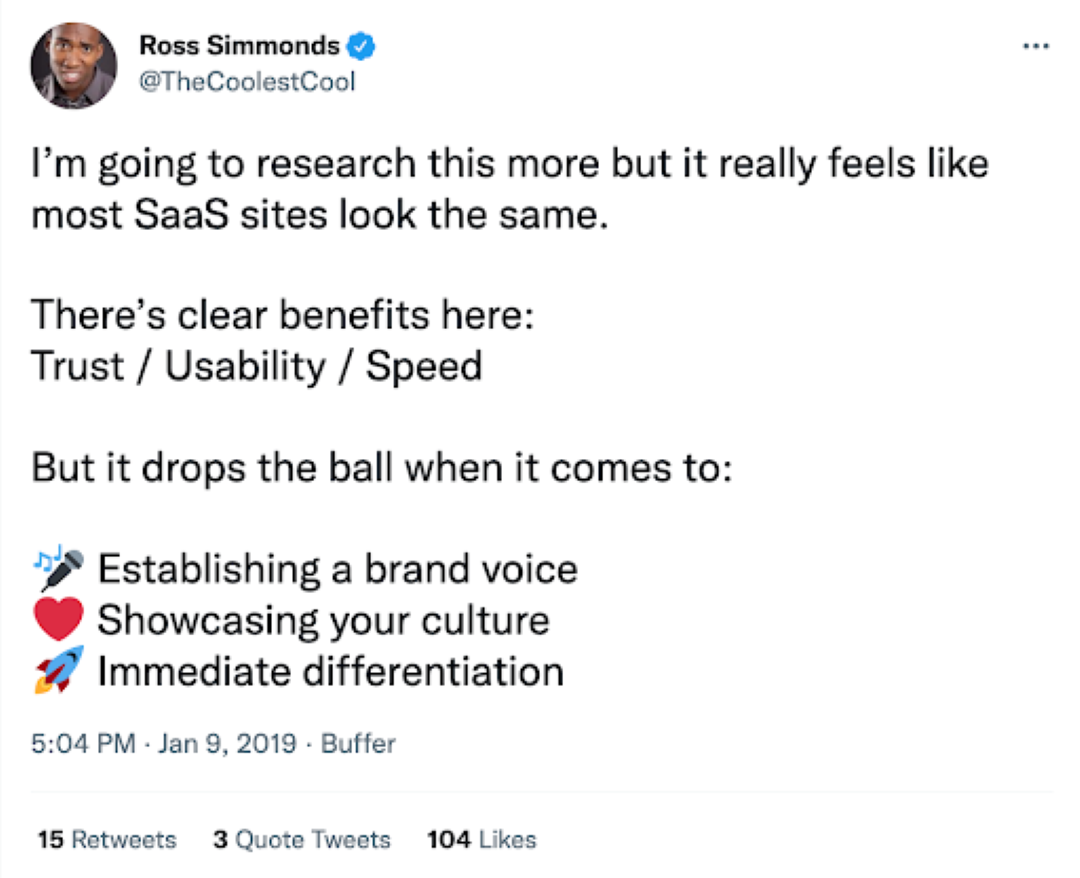
That’s the question I set out to answer after stumbling on one SaaS site, after SaaS site, after SaaS site… They looked pretty much the same:
Understanding best practices can be a great way for web designers (and SaaS founders) to think about their own brand presence. It’s an approach Andy Crestodina took a few years back when analyzing web standards for the top 50 marketing sites. It can also help designers, strategists, and founders plan their design initiatives by using wireframes and identifying what key design elements need to be on their homepage.
The Nielsen / Norman Group published one of the first pieces of documentation around Web Design Standards and defined three levels of standardization:
- Standard: 80%+ of sites use the same approach
- Convention: 50 – 79% of websites use the same approach
- Confusion: 49% or fewer websites use an approach
While I originally had a lot of frustration with the lookalike SaaS brands, the further I looked at the reasoning for following design standards and best practices, the more I understood the benefit of consistency. Some of the benefits that come with following design web standards include:
- A sense of security & trust when seeing common design elements
- Knowing exactly where to go when you need something (i.e., Home via. logo click)
- No uncertainty around new icons, buttons, and design elements. No key elements (i.e., Get a demo) missed
All of these things can make the user experience smoother and more intuitive.
But there are a lot of things in the SaaS space that seem to be replicated without any good reason.
So to better understand SaaS Web Design Standards, we took the top 250 sites from the SaaS 1000 to create a data set that showed us what things had become standards, what were conventional, and what was a coin flip.
Here’s a closer look at the SaaS design best practices happening in 2022:
Brand Logos Are Always On The Left Hand Side
![]()
So, you’ve decided to create a logo (or update your existing one) and are wondering where on your website to place it. The placement of your logo on the top left of a website is a common design best practice. We have even seen a 1% increase in logos to the left of the navigation since 2019! It’s an approach most web designers leverage inside and outside of SaaS. It’s a logical choice to recognize that most people in North America view a site from left to right.
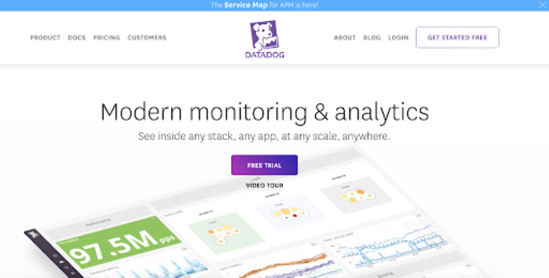
But sometimes (in our research; once), a designer decides to place the logo somewhere else. While we didn’t see any sites place their logo on the right; we did find DataDog who placed their logo directly in the middle of their site:
In a logo research study, the folks at Venngage found that 35% of people preferred text-dominant and horizontal-style logos for tech companies.
Most SaaS Websites Are Mobile Responsive
We live in a mobile world.
Mobile responsive sites are a great way to ensure you don’t deliver broken experiences for people on a desktop or visiting on mobile.
In 2018, 52.2% of all worldwide online traffic was generated through mobile phones. That’s why it’s so great to see that almost all SaaS companies are investing in a responsive design & mobile landing page best practices rather than solely building for desktops.
Video Can Be Found On A Third Of Sites
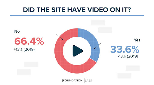
Although video has taken social media channels by storm, it’s not as popular on SaaS websites. Of the websites that did feature a video on their homepage, most videos required users to click to start the video. These videos were usually short clips, most under 5 minutes, that provided context on the company’s history, value proposition, or product demonstration.
We were very surprised to find that most websites don’t have videos on their homepages and even more surprised to see a 13% decline since our previous study in 2019.
The legacy cost expectations that come with producing a high-quality video may still be holding brands back from this investment. Illustrated product explainers surged in popularity a few years ago and became a popular service bought through sites like Fiverr and Upwork.
Today, the demand for these types of videos is still quite high (more than 14,800 searches for explainer videos per month), yet only a little over half of SaaS companies use them.
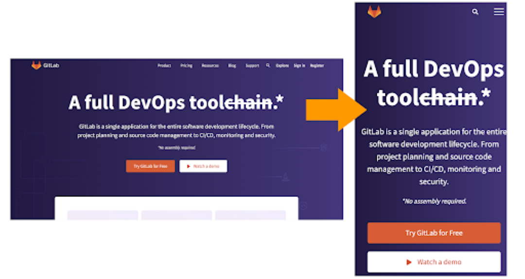
There’s Always a Primary Call To Action Above The Fold
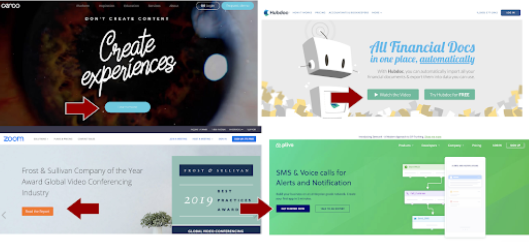
There’s a clear best practice in the SaaS community that your call to action driving people to do something needs to be above the fold. More than 90% of all sites that were included in this SaaS Design research had a button or call to action above the fold.
The Placement Of The CTA Can Usually Be Found Above The Fold
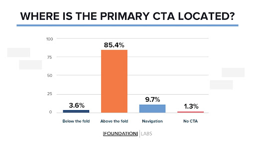
Most SaaS websites cut to the chase when it comes to where the CTA is placed. The majority of websites put their CTA above the fold. This is a good practice to follow because it ensures that users see your CTA even if they don’t scroll all the way down the page..
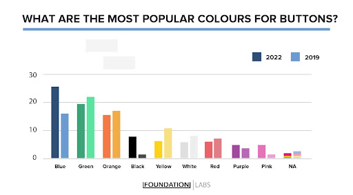
Blue Passes Green As The New Choice For SaaS Buttons
When analyzing the various call-to-action colors, there was a clear trend towards blue, with green CTA’s coming in second and orange in third.
The popularity of blue CTA buttons has grown significantly since 2019, surpassing green by about 3% (which was the most popular CTA color in 2019). There is a good reason for this: the color blue is most commonly used for hyperlinks, and it is an eye-catching color.
Free Trial Surpasses Get Started As The Most Popular CTA In SaaS
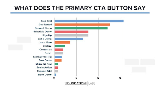
A majority of SaaS brands are using call-to-action lingo that is music to their wallets: free.
Most of the sites we reviewed opted for the phrasing “Free Trial” for their call to action. Another runner-up CTA were an action-oriented language that enticed the visitor to do something that pushed them further in the funnel. Some variations include:
- Get Started
- Request A Demo
- Schedule A Demo
- Sign Up
- Get A Free Demo
- Get X For Free
The most common words + phrases within the call to action tend to be: Free, Demo, Get, Started, Try X and Request… Some of these words showed up together (i.e., Free Demo or Try X For Free), but using a combination of these words tends to show up most in SaaS primary CTAs.
Using A Light Background Is Best Practice
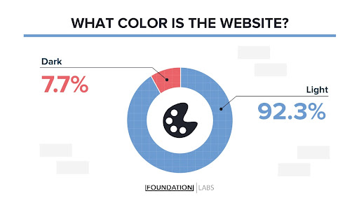
It’s not common to see a site that has a black background in SaaS:
Most of the sites (92% of them) used white or light colors as the primary background for their sites.
Using Real People Is Used by 80% Of SaaS
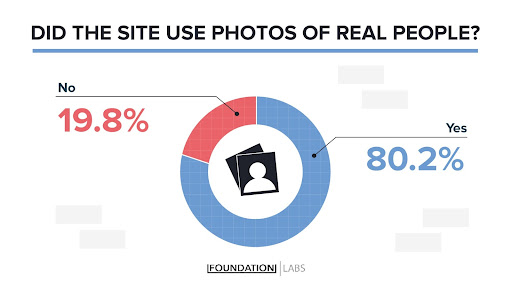
The placement of real people on the homepage was the favorable option for a majority of SaaS brands. The placement of real people on the homepage was usually found in sections paired with testimonials and content assets. Occasionally they appeared directly above the fold in the header, like the example below, but most times, real people imagery was featured further down the page.
This is a HUGE jump from the same study we conducted in 2019. Just 3 years ago, only 56% of websites used real people on their homepages, representing a whopping 24% increase.

It was also great to see quite a bit of diversity in the image selection. The only thing missing was seeing a similar level of diversity on those “Our Team” pages, but that’s a topic for another time.
Custom Illustrations Are Very Common (70%)
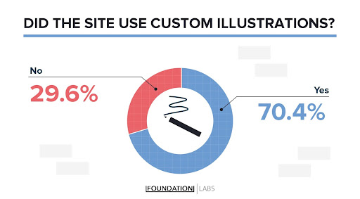
The rise of custom illustrations has swept the SaaS community by storm. For the last 3 years, it’s something that has been popping up on site after site. Our professional opinion is that this is a trend, but it’s only a few percentages points off from becoming a best practice.
Here’s a snapshot of some of the sites and their illustrations:
This is an interesting trend.
What do you think: Does this approach to design help startups stand out, or does it result in them blending in? Does it matter? Does it give off a sense of trust?
Half Of The SaaS Brands Use A Live Chat Tool
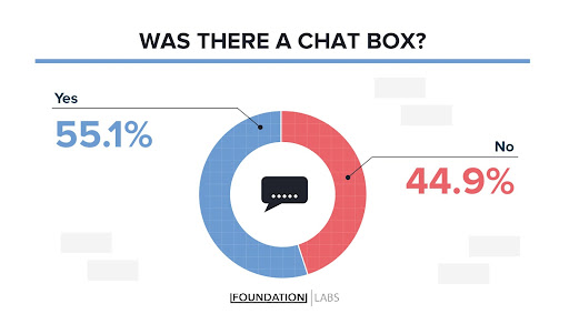
The rise of conversational marketing and advanced customer service solutions like live chat has been a fascinating trend to watch. Users want answers, and they want them quickly. As this idea of embracing real-time conversations with prospects (or using bots) continues to catch traction, it’s clearly becoming popular amongst B2B SaaS companies.
Our research found that a little over 5% of SaaS sites have a chat box in the corner ready to be engaged with. Across most of these sites, the services being used were Intercom or Drift.
So Should You Follow The Standards?
It depends.
Experimenting with website design is a great way to uncover something before the rest of the industry. That said, the risk of design experimentation is that users could find the entire experience broken and poorly created. On the other hand, if you adhere to the standards that are already in use across SaaS websites around the world, you could easily blend in.
Here’s a list of website design tips if you want a site that isn’t like everyone else:
- Don’t use flat illustration as an abstract representation of your brand
- Don’t use dark orange or yellow buttons on your homepage
- Don’t left align your value proposition on the site
- Place your logo in the middle or on the right
- Use a dark background for your site
Does your site currently meet these standards? Did anything here surprise you?
